
Reusable, storage-backed dashboard cards for Home Assistant UI-mode dashboards.
Linked Cards fills the gap between Home Assistant's friendly visual dashboard editor and YAML-only reuse tools such as decluttering-card. Define a master card template once, then place lightweight linked instances anywhere. When the master template changes, every linked instance renders the new card configuration after refresh.
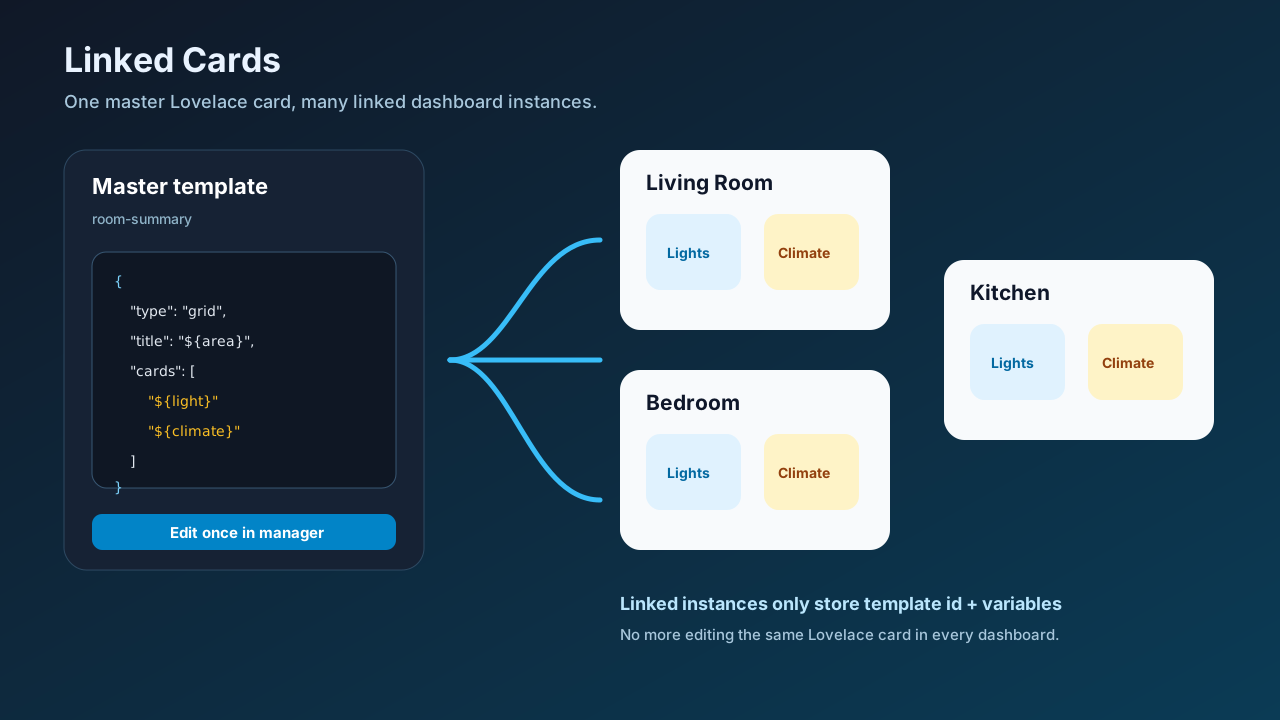
Why this exists
Home Assistant users often maintain several dashboards: wall tablet, phone, admin, energy, room-specific views, guest views. The same room card, security card, navigation card, or status stack is copied repeatedly. Today that means:
- edit the same card YAML in multiple places;
- risk inconsistent versions across dashboards;
- use YAML-heavy
decluttering-card/streamline-card; or - give up the UI dashboard editor.
Community requests repeatedly ask for native "master card", "linked card", or "reusable card" support in UI mode. This project is a practical HACS-friendly implementation of that missing layer.
What it provides
custom:linked-card— renders a stored master card by template id, or renders cards directly from another dashboard/view.custom:linked-section— renders a stored master section (title + card grid) by template id.linked-card-manager— now creates and edits both card and section templates from the Home Assistant UI.- Visual editor support for
custom:linked-cardinstances: template picker, variable overrides, source-dashboard mode, and inline/popup display. - Source-dashboard mode compatible with Global-cards-style workflows: maintain pop-ups, headers, or shared UI on a source dashboard and reuse them elsewhere.
- Home Assistant custom integration storage under
.storage/linked_cards.templates. - Safe variable substitution using
${variable}placeholders. - Any Lovelace card can be the child card: tile, grid, entities, custom cards, Bubble Card pop-ups, etc.
- Live template update events: saved/deleted templates re-render affected linked-card instances without waiting for a full dashboard refresh.
- Template export/import from the manager card.
- Static JS resource served by the integration at
/linked-cards/linked-card.js. - REST API for advanced users and future UI tooling.
Installation
HACS custom repository
- HACS → Integrations → ⋮ → Custom repositories.
- Add this repository URL.
- Category: Integration.
- Install Linked Cards.
- Restart Home Assistant.
- Go to Settings → Devices & services → Add integration and add Linked Cards.
- Add the frontend resource:
url: /linked-cards/linked-card.js
type: module
Or add it from Settings → Dashboards → Resources.
Manual install
Copy this folder into Home Assistant:
custom_components/linked_cards
Restart Home Assistant, add Linked Cards from Settings → Devices & services, then add the resource:
/linked-cards/linked-card.js
Quick start
1. Add a manager card to an admin-only dashboard
type: custom:linked-card-manager
template: room-summary
Paste and save this master template:
{
  "description": "Reusable room summary grid with a light and climate tile.",
  "variables": {
    "area": "Living Room",
    "light": "light.living_room",
    "climate": "climate.living_room"
  },
  "card": {
    "type": "grid",
    "title": "${area}",
    "columns": 2,
    "square": false,
    "cards": [
      {
        "type": "tile",
        "entity": "${light}",
        "name": "Lights",
        "features": [{ "type": "light-brightness" }]
      },
      {
        "type": "tile",
        "entity": "${climate}",
        "name": "Climate",
        "features": [{ "type": "target-temperature" }]
      }
    ]
  }
}
2. Place linked instances anywhere
Use the Home Assistant visual editor when adding custom:linked-card. The editor lets you select Template mode, choose a stored template, and enter variable overrides as JSON.
Living room:
type: custom:linked-card
template: room-summary
variables:
  area: Living Room
  light: light.living_room
  climate: climate.living_room
Bedroom:
type: custom:linked-card
template: room-summary
variables:
  area: Bedroom
  light: light.bedroom
  climate: climate.bedroom
Kitchen with a fallback if the template is missing:
type: custom:linked-card
template: room-summary
variables:
  area: Kitchen
  light: light.kitchen
  climate: climate.kitchen
fallback:
  type: markdown
  content: Linked card template is not available.
Source-dashboard mode
Source-dashboard mode lets you maintain shared cards on a normal Home Assistant dashboard and render them elsewhere. This is useful for Global-cards-style workflows such as Bubble Card pop-ups, shared headers, and reusable navigation sections.
Create a source dashboard, for example global-cards, then add the cards you want to reuse with Home Assistant's normal visual editor.
Inline shared cards
type: custom:linked-card
mode: source
source_dashboard: global-cards
source_view: header
source_display: inline
source_dashboardis the dashboardurl_path.source_viewis optional and can be a view path or view title. Omit it to load all views.source_display: inlinerenders the cards in place.- Sections views are supported; card
grid_options.columnsare respected in a 12-column grid fallback.
Popup/invisible source cards
type: custom:linked-card
mode: source
source_dashboard: global-cards
source_view: popups
source_display: popup
source_display: popup mounts the source cards invisibly under the Lovelace root in normal view mode. In edit mode, the card shows a status panel with the dashboard, view, display mode, and loaded card count.
This pattern works well for Bubble Card pop-ups defined once on a source dashboard and opened from buttons on other dashboards.
Linked Sections
Just as linked cards let you define a master card once and reuse it everywhere, linked sections let you define a reusable section (title + grid of cards) as a stored template and place it on any dashboard with custom:linked-section.
A section template stores a title and an array of cards, along with optional grid_options.columns to control default column sizing. Variables let you parameterise entity IDs, titles, and any other card field.
Create a section template
Use the manager card and select Section template to save a master section:
{
  "description": "Reusable room controls section with lights and climate.",
  "variables": {
    "area": "Living Room",
    "light": "light.living_room",
    "climate": "climate.living_room"
  },
  "section": {
    "title": "${area} Controls",
    "grid_options": { "columns": 2 },
    "cards": [
      {
        "type": "tile",
        "entity": "${light}",
        "name": "Lights",
        "features": [{ "type": "light-brightness" }]
      },
      {
        "type": "tile",
        "entity": "${climate}",
        "name": "Climate",
        "features": [{ "type": "target-temperature" }]
      }
    ]
  }
}
Place a linked section
type: custom:linked-section
template: room-controls
variables:
  area: Living Room
  light: light.living_room
  climate: climate.living_room
For the office:
type: custom:linked-section
template: room-controls
variables:
  area: Office
  light: light.office
  climate: climate.office
The section renders with the given title and cards, all laid out in a responsive grid. Edit the master template once; refresh dashboards and all uses show the new configuration.
Section schema
| Field | Required | Type | Description |
|---|---|---|---|
title |
Yes | string | Section heading. Supports ${variable} substitution. |
cards |
Yes | array | Array of Lovelace card configs. |
grid_options.columns |
No | number | Default column count used to size cards that don’t set their own grid_options.columns. |
Template format
{
  "description": "Optional human-readable notes.",
  "variables": {
    "default_name": "Default values are optional"
  },
  "card": {
    "type": "tile",
    "entity": "${entity}",
    "name": "${name}"
  }
}
Rules:
cardis required and must be a Lovelace card object.variablesis optional and supplies defaults.- Instance variables override template defaults.
- Placeholders work in strings and object keys:
${area},${entity},${nested.value}. - Missing variables render as an empty string so a broken template is visible rather than silently using stale values.
- Template ids may contain letters, numbers,
.,_, and-only.
Manager export/import
The custom:linked-card-manager card can:
- save and delete stored templates;
- export the selected template as JSON;
- export all templates as a JSON archive;
- import a template JSON file and save it back to Home Assistant storage.
Imported files may use either of these shapes:
{ "template_id": "room-summary", "template": { "card": { "type": "tile", "entity": "light.example" } } }
or a raw template payload:
{ "variables": {}, "card": { "type": "tile", "entity": "light.example" } }
API
All endpoints require normal Home Assistant authentication.
List templates
GET /api/linked_cards/templates
Response:
{
  "templates": {
    "room-summary": {
      "variables": {},
      "card": { "type": "tile", "entity": "light.example" }
    }
  }
}
Save template
POST /api/linked_cards/templates/room-summary
Content-Type: application/json

{
  "variables": { "entity": "light.example" },
  "card": { "type": "tile", "entity": "${entity}" }
}
Delete template
DELETE /api/linked_cards/templates/room-summary
Live update event
When a template is saved or deleted, the integration fires a Home Assistant event:
linked_cards_template_updated
Event data:
{ "template_id": "room-summary", "action": "saved" }
Open linked-card instances subscribe to this event, invalidate the affected cache entry, and re-render matching template-based cards.
Example patterns
Shared navigation card
Create one navigation grid and reuse it on every dashboard. Update paths/icons once.
{
  "card": {
    "type": "grid",
    "columns": 4,
    "square": false,
    "cards": [
      { "type": "button", "name": "Home", "icon": "mdi:home", "tap_action": { "action": "navigate", "navigation_path": "/lovelace/home" } },
      { "type": "button", "name": "Lights", "icon": "mdi:lightbulb", "tap_action": { "action": "navigate", "navigation_path": "/lovelace/lights" } },
      { "type": "button", "name": "Energy", "icon": "mdi:lightning-bolt", "tap_action": { "action": "navigate", "navigation_path": "/energy" } },
      { "type": "button", "name": "Security", "icon": "mdi:shield-home", "tap_action": { "action": "navigate", "navigation_path": "/lovelace/security" } }
    ]
  }
}
Shared device-status card
Use one template for routers, servers, NAS devices, or 3D printers.
{
  "variables": {
    "name": "Device",
    "power": "sensor.device_power",
    "status": "binary_sensor.device_online"
  },
  "card": {
    "type": "entities",
    "title": "${name}",
    "entities": ["${status}", "${power}"]
  }
}
Security and privacy
- Templates are stored locally in Home Assistant storage.
- The integration does not call external services.
- Normal Home Assistant auth protects the API.
- Template reads are available to authenticated users so linked cards can render.
- Template create/update/delete actions require a Home Assistant administrator account.
- Template ids, size, nesting depth, count, and top-level shape (
cardorsection) are validated server-side. - Do not store secrets in card templates. Treat template JSON like dashboard YAML.
Limitations
- Source-dashboard mode reads Lovelace dashboard config through the frontend connection; the source dashboard must be accessible to the current user.
- Source-dashboard configs are cached in the browser for 60 seconds.
- The manager's template body remains JSON so any Lovelace/custom card can be represented exactly. Use source-dashboard mode when you want to author the shared card itself with Home Assistant's native visual editor.
- Variables are string interpolation, not arbitrary JavaScript or Jinja. This is intentional for safety and portability.
- Cross-dashboard use works because templates are stored globally by the integration, not inside a single dashboard config.
Roadmap
- Visual template picker/editor for linked-card instances.
- Visual template picker/editor for linked-section instances.
- Source-dashboard mode for Global-cards-style reusable pop-ups/headers.
- Live update event after saving/deleting a template.
- Template export/import.
- Import duplicated existing dashboard cards as stored templates.
- Per-template usage search across dashboards.
- Optional variable schema so instances get a richer generated UI form.
Development
npm install
npm test
npm run build
Build output is copied to:
custom_components/linked_cards/www/linked-card.js
Validation performed
- Vitest unit tests for template id validation, recursive variable rendering, default/override behaviour, source-dashboard structure extraction, editor wiring, live event wiring, and package layout.
- ESBuild bundle generation.
- Python syntax compilation for the Home Assistant custom component.
- README verified for v0.2.0 feature coverage: source-dashboard mode, visual editor, live events, export/import, and updated roadmap.
This project was developed with the assistance of AI tools.
Comments