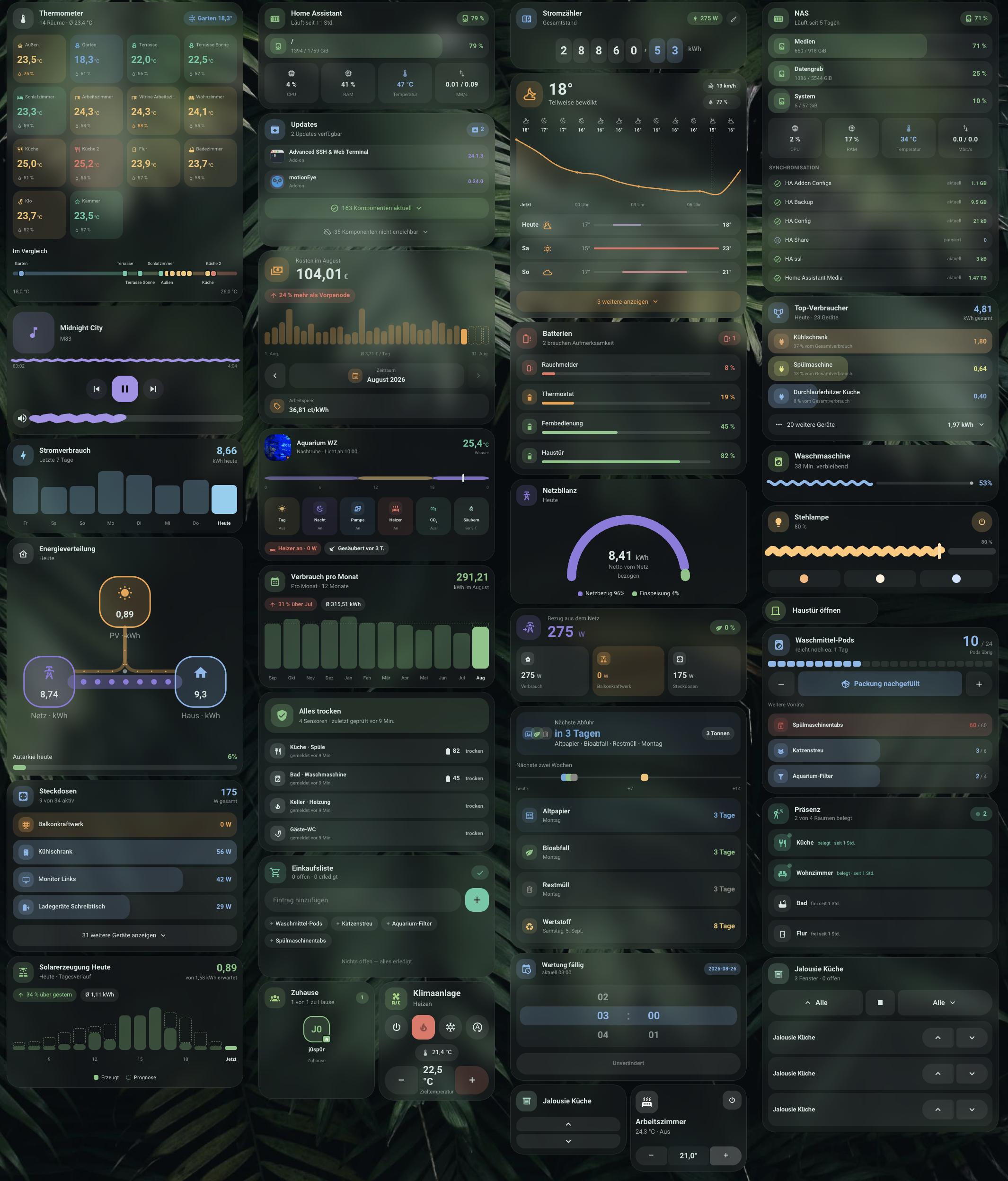
⚠️ Beta: This project is new and under active development. Configuration options may still change between versions — please file an issue if you run into something.
Material 3–inspired, native Lovelace cards for Home Assistant — built with
TypeScript + Lit, without any dependency on
button-card, card-mod, mod-card, or stack-in-card. A single bundle
(m3-cards.js) registers 29 cards, all sharing one design language.
New here? Start with the category that matches what you want to show — every card links to its full documentation further down.
🔌 Energy & power
| Card | Type | What it does |
|---|---|---|
| Energy | m3-energy-card |
Bar chart per day/hour/month, or a solar day timeline with forecast |
| Cost | m3-cost-card |
Cost breakdown with projection, comparison chip and daily bars |
| Gauge | m3-gauge-card |
Semicircular gauge for the ratio of two quantities |
| Energy Flow | m3-energy-flow-card |
Node diagram of today's solar/grid/home flows |
| Power Summary | m3-power-summary-card |
Grid balance, consumption, generation and self-sufficiency |
| Power List | m3-power-list-card |
Sorted list of power sensors with threshold filter and share bar |
| Top Consumers | m3-top-consumers-card |
Ranking of the largest consumers, by kWh or cost |
| Counter | m3-counter-card |
A meter reading as a rolling digit display |
🌡️ Climate & weather
| Card | Type | What it does |
|---|---|---|
| Climate | m3-climate-card |
Full control for a climate entity (AC / thermostat) |
| Climate Mini | m3-climate-card-mini |
Compact climate variant for narrow layouts |
| Climate Overview | m3-climate-overview-card |
Room-by-room temperature/humidity, grouped by area |
| Weather | m3-weather-card |
Temperature curve, precipitation bars, sun markers |
💡 Light, media & control
| Card | Type | What it does |
|---|---|---|
| Light | m3-light-card |
Light control with a wavy brightness slider, color temp and color wheel |
| Media | m3-media-card |
Media player with artwork colors, wave sliders and a library browser |
| Button | m3-button-card |
Generic button/entity card for any domain |
| Cover | m3-cover-card |
Blinds/shutters that adapt to the device's capabilities, plus a group mode |
🚪 Presence & safety
| Card | Type | What it does |
|---|---|---|
| Presence | m3-presence-card |
Who's home — avatar grid for person/device_tracker |
| Occupancy | m3-occupancy-card |
Room-by-room presence with an activity timeline |
| Leak | m3-leak-card |
Water-sensor overview with a quiet OK state and a loud alarm + shut-off |
🧺 Household & planning
| Card | Type | What it does |
|---|---|---|
| Progress | m3-progress-card |
Appliance progress with a Material 3 wavy indicator |
| Supply | m3-supply-card |
Consumables: amount left, range estimate, one-tap refill |
| Todo | m3-todo-card |
Shopping and task lists with quick-add chips |
| Waste | m3-waste-card |
Bin-collection schedule with a two-week timeline and reminder mode |
| Time | m3-time-card |
Time picker for an input_datetime helper |
🛠️ System & maintenance
| Card | Type | What it does |
|---|---|---|
| Battery | m3-battery-card |
Battery levels across all device_class: battery sensors |
| Updates | m3-updates-card |
Every available update (core, OS, add-ons, HACS, firmware) |
| NAS | m3-nas-card |
NAS volumes, CPU, RAM, network via Glances + Syncthing |
| System | m3-system-card |
The same, fed by the System Monitor integration |
🐠 Special
| Card | Type | What it does |
|---|---|---|
| Aquarium | m3-aquarium-card |
Per-aquarium devices, lighting arc, camera and maintenance |
All cards at a glance:
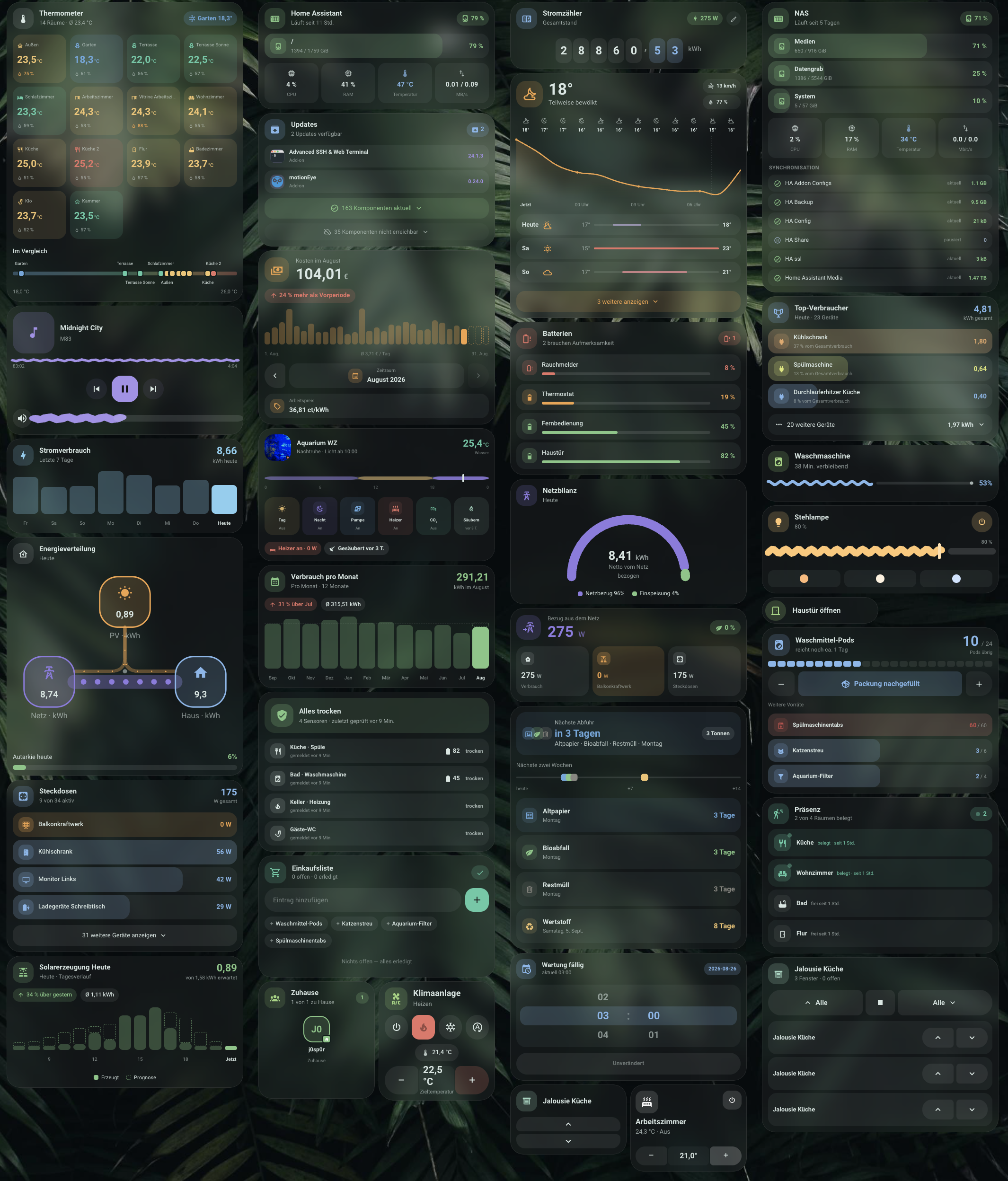
Taken on a real Home Assistant instance. The washing machine, floor lamp, speaker, air conditioner and the updates show simulated states so the active renderings (wave indicator, version jump, running installation) are visible in the image — everything else is live data.
Features
- Frosted glass card look (can be turned off for solid themes), shared design language across all cards
- Mode pills with shape-morph animation (round → rounded rectangle)
- Temperature stepper with step size/limits taken from the entity
- Optional external temperature/humidity sensors, window and battery chips
- Preset support (tap to cycle, as its own row or as a pill in the mode row)
- Configurable card height + full height matching in
horizontal-stack/grid layouts for tiles of exactly equal height - Full graphical editor (no YAML required) — modeled after the native tile card editor, with a unified appearance panel (corner-radius presets, per-corner overrides) across every card
unavailablehandling without crashing: values shown as "–", controls dimmed- Localized in German/English (follows
hass.locale.language) - Accessible: every interactive element is keyboard-reachable
(Tab/Enter/Space) with a visible focus ring and
aria-label - Respects
prefers-reduced-motionthroughout, additionally overridable per card viaanimation: auto | on | off - Old configs (e.g.
animations: true/false) are migrated to the current schema automatically on load — no manual dashboard edits needed
Installation
HACS (recommended)

The button opens the repository straight in your own Home Assistant — press Download and you are done. To add it by hand instead:
- HACS → menu (⋮) in the top right → Custom repositories
- Enter the repository URL, pick type Dashboard, then Add (not Integration — this is a Lovelace card, not an integration)
- Search for "M3 Cards", open it and press Download
- Reload Home Assistant
Manual
- Download the latest
m3-cards.jsfrom the Releases - Copy it to
config/www/m3-cards.js - Add the resource in Home Assistant:
Settings → Dashboards → Resources → Add resource
- URL:
/local/m3-cards.js - Type: JavaScript module
- URL:
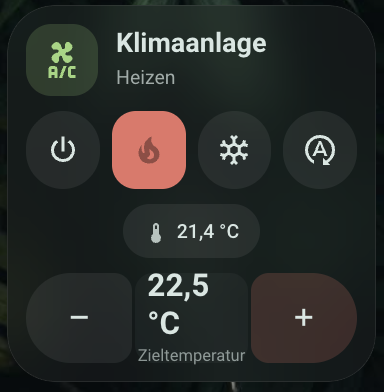
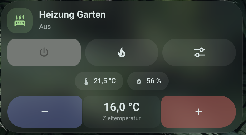
M3 Climate Card
Add the card via the dashboard editor (search for "M3 Climate Card") or via YAML:
type: custom:m3-climate-card
entity: climate.living_room
name: Living Room
show_presets: true
preset_style: chip # chip | pill
show_sensors: true
temperature_chip_placement: info_row # info_row | header
temperature_sensor: sensor.living_room_temperature
humidity_sensor: sensor.living_room_humidity
window_sensor: binary_sensor.living_room_window
battery_sensor: sensor.thermostat_battery
battery_threshold: 20
glass_background: true
hidden_modes: []
height: 380
mode_colors:
  heat: "#e57368"
  cool: "#6ba7dc"
Configuration options
| Option | Type | Default | Description |
|---|---|---|---|
entity |
string | Required | climate.* entity |
name |
string | entity friendly_name |
Displayed name |
icon |
string | mdi:radiator (heating only) / mdi:air-conditioner |
Header icon |
show_presets |
boolean | true |
Show preset selector (if the entity supports preset_modes) |
preset_style |
chip | pill |
chip |
Preset as its own wide row (chip) or as an extra pill in the mode row (pill) |
show_sensors |
boolean | true |
Show sensor chips (temperature/humidity) |
temperature_chip_placement |
info_row | header |
info_row |
Current temperature in the sensor row or as a chip top-right in the header |
temperature_sensor |
string | – | External temperature sensor, overrides current_temperature |
humidity_sensor |
string | – | External humidity sensor, overrides current_humidity |
window_sensor |
string | – | binary_sensor, shows an "Open" chip when state: "on" |
battery_sensor |
string | – | Sensor for battery level |
battery_threshold |
number | 20 |
Threshold (%) below which the battery chip appears |
hidden_modes |
string[] | [] |
HVAC modes that are hidden as a pill despite entity support |
glass_background |
boolean | true |
Frosted glass background (off for solid themes) |
animations |
boolean | true |
Shape-morph/press animations; false disables all transitions |
unavailable_style |
dimmed | normal | hidden |
dimmed |
Display when the entity is unavailable/unknown: dimmed (greyed out, not tappable, as before), normal (normal display, mode pills/stepper stay tappable), or hidden (card is fully hidden) |
height |
number (px) | – (automatic) | Fixed minimum card height. See Equal-height tiles |
radius |
number (px) | 32 |
Card corner radius (editor offers Square/Slightly rounded/Round/Custom) |
corners |
object | – | Optional per-corner override: top_left, top_right, bottom_right, bottom_left (px) — for asymmetric Material 3 Expressive shapes, only overrides radius for the given corners |
mode_colors |
object | see below | Color override per HVAC mode. The editor shows a text field + color swatch; accepts hex/CSS or HA color names, same as the button card's color |
icon_active_color |
string | var(--primary-color) |
Header icon color when active (not "off") |
icon_inactive_color |
string | var(--primary-color) |
Header icon color in the "off" state |
plus_active_color |
string | current mode's color | Plus button color when active |
plus_inactive_color |
string | mode_colors.off |
Plus button color in the "off" state |
minus_active_color |
string | var(--primary-text-color) |
Minus button color when active |
minus_inactive_color |
string | var(--primary-text-color) |
Minus button color in the "off" state |
Without any explicit setting, the icon stays in the theme accent color
(--primary-color) as before; minus stays neutral. icon_active_color /
icon_inactive_color / plus_active_color / plus_inactive_color /
minus_active_color / minus_inactive_color allow a fully independent
color per element and state ("off" vs. active).
Default mode colors
| Mode | Color |
|---|---|
off |
#9e9e9e |
heat |
#e57368 |
cool |
#6ba7dc |
dry |
#5dcaa5 |
auto |
#5dcaa5 |
fan_only |
#b8c4c9 |
heat_cool |
#e5a768 |
Equal-height tiles
HA's native masonry dashboard does not automatically equalize the height of cards next to each other — every column grows independently based on its own content. Two options:
- Use
horizontal-stack(recommended, no manual value needed): cards in ahorizontal-stackare automatically stretched by Home Assistant via flexbox to the height of the tallest card — the M3 cards fill that height completely (including the stepper, which docks to the bottom):type: horizontal-stack cards: - type: custom:m3-climate-card entity: climate.ac - type: custom:m3-climate-card entity: climate.living_room - Set
heightmanually: if nohorizontal-stackis used, a fixed pixel value (height: 380) can be set per card.
M3 Climate Card Mini
A compact companion card to the full climate card: icon tile + on/off button on top, name + "current temperature · mode" below that, a minus/target-temperature/plus stepper at the bottom. No preset, sensor, or mode-row support — in exchange, two tiles comfortably fit side by side on a phone screen.
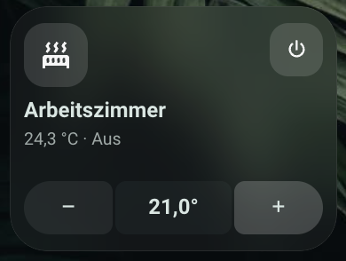
type: custom:m3-climate-card-mini
entity: climate.bedroom
name: Bedroom
glass_background: true
mode_colors:
  heat: "#e57368"
  cool: "#6ba7dc"
Configuration options
| Option | Type | Default | Description |
|---|---|---|---|
entity |
string | Required | climate.* entity |
name |
string | entity friendly_name |
Displayed name |
icon |
string | mdi:radiator (heating only) / mdi:air-conditioner |
Icon in the icon tile |
glass_background |
boolean | true |
Frosted glass background (off for solid themes) |
animations |
boolean | true |
Transitions for icon tile/on-off button/stepper; false disables them |
unavailable_style |
dimmed | normal | hidden |
dimmed |
Display when the entity is unavailable/unknown |
radius |
number (px) | 28 |
Card corner radius (editor offers Square/Slightly rounded/Round/Custom) |
corners |
object | – | Optional per-corner override: top_left, top_right, bottom_right, bottom_left (px) |
mode_colors |
object | see default mode colors | Color override per HVAC mode |
icon_active_color |
string | current mode's color | Icon color when heating/cooling is active (not "off") |
icon_inactive_color |
string | mode_colors.off |
Icon color in the "off" state |
power_active_color |
string | current mode's color | On/off button color when active |
power_inactive_color |
string | mode_colors.off |
On/off button color in the "off" state |
plus_active_color |
string | current mode's color | Plus button color when active |
plus_inactive_color |
string | mode_colors.off |
Plus button color in the "off" state |
minus_active_color |
string | var(--primary-text-color) |
Minus button color when active |
minus_inactive_color |
string | var(--primary-text-color) |
Minus button color in the "off" state |
Icon, on/off button, and plus color follow mode_colors by default
(including "off"), so they can already be adjusted just via
mode_colors.off; minus stays neutral by default. icon_active_color /
icon_inactive_color / power_active_color / power_inactive_color /
plus_active_color / plus_inactive_color / minus_active_color /
minus_inactive_color additionally allow a fully independent color per
element and state.
The on/off button calls homeassistant.toggle on the entity. Tapping the
icon tile, the name/status, or the target-temperature display opens the
more-info dialog.
M3 Button Card
A generic card for entities outside of climate (buttons, switches,
lights, scenes, door sensors, ...) in the same design.
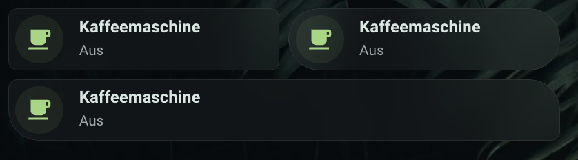
type: custom:m3-button-card
entity: button.front_door_open
name: Open front door
icon: mdi:door
color: dark-grey
state_colors:
  open: red
  locked: green
show_state: false
show_icon_background: true
show_slider: false
vertical: false
radius: 28
glass_background: true
tap_action:
  action: toggle
hold_action:
  action: more-info
Configuration options
| Option | Type | Default | Description |
|---|---|---|---|
entity |
string | – (optional) | Any entity — including automation.*, script.*, scene.*. Can be left empty for a pure action button without an entity state (see below) |
name |
string | entity friendly_name |
Displayed name |
icon |
string | entity icon, otherwise HA's default icon for the domain/device_class |
Icon. Without an explicit value, the same default icon HA computes for the native tile card is used (e.g. a thermometer for device_class: temperature), not just an icon explicitly set on the entity |
color |
string | primary (uses HA's theme accent color) |
HA color name (red, dark-grey, deep-orange, ...) or any CSS color (#hex, rgb(...)) for the icon/background in the on/active state |
inactive_color |
string | – (default theme grey) | Color for the icon/background in the off/inactive state, same format as color. Also used when static_color: true is set |
invert_colors |
boolean | false |
Swaps color and inactive_color (or their defaults) without needing custom colors — e.g. to quickly flip "light in the off state, accent color in the on state" into "accent color in the off state, light in the on state" |
state_colors |
object | – | Color override per entity state (e.g. open, locked), overrides color only for that state. The editor offers the most common states as fields; any state name is possible via YAML |
static_color |
boolean | false |
Always show the icon/background in inactive_color (or the default grey), regardless of entity state — e.g. for devices that are permanently on and shouldn't be visually highlighted as "active". Freely stylable via inactive_color |
unavailable_style |
dimmed | normal | hidden |
dimmed |
Display when the entity is unavailable: dimmed (greyed out, not tappable, as before), normal (normal display, stays tappable — e.g. so hold_action: more-info remains usable for diagnostics), or hidden (card is fully hidden) |
show_state |
boolean | true |
Show the status line under the name |
state_content |
state | last_changed | last_updated |
state |
Content of the status line: the entity state itself, or a relative time since the last state change / last update (e.g. "3 hours ago") |
show_icon_background |
boolean | true |
Colored circle behind the icon |
icon_size |
number (px) | – (automatic, scales with card height) | Fixed icon size independent of card height, so buttons of different height (e.g. rows: 1 vs. rows: 2) have visually equal-sized icons |
align_icons |
boolean | false |
Align icons at the same distance from the left edge regardless of card height — useful together with icon_size so stacked cards of different heights line up visually. Vertical centering is unaffected |
show_slider |
boolean | false |
Show a slider under the icon/text — only effective for light (brightness), cover (position), fan (speed), input_number/number (value) |
vertical |
boolean | false |
Icon above the text instead of next to it |
radius |
number (px) | 28 |
Card corner radius. In the editor as a preset ("Square" 8px / "Slightly rounded" 16px / "Round" 28px) or freely chosen |
corners |
object | – | Optional per-corner override: top_left, top_right, bottom_right, bottom_left (px) — for asymmetric Material 3 Expressive shapes, e.g. a button with only one rounded side |
glass_background |
boolean | true |
Frosted glass background |
animations |
boolean | true |
Press animation (slight sink-in on tap); false disables all transitions |
tap_action |
Action | domain-dependent | Chosen sensibly by default: automation.trigger/script.turn_on/scene.turn_on/button.press for the respective domain, toggle for light/switch/etc., otherwise more-info |
hold_action |
Action | more-info |
Action on long-press (on the whole tile) — same as the native tile card |
double_tap_action |
Action | none |
Action on double-tap (on the whole tile) |
icon_tap_action |
Action | more-info |
Its own tap action for just the icon/icon circle, independent of tap_action — same as the native tile card |
icon_hold_action |
Action | none |
Action on long-press on the icon |
icon_double_tap_action |
Action | none |
Action on double-tap on the icon |
Active states (on, open, home, playing, ...) color the icon and
icon background in the configured color (or the matching
state_colors override); entities without a persistent state (button,
script, scene) are always colored.
Triggering automations/scripts/scenes works like any other entity —
entity: automation.good_morning is enough, a tap triggers the automation
directly thanks to the domain-dependent default tap_action (no manual
call-service needed unless you want something different).
Pure action button (without an entity)
entity can be omitted entirely if the card should only trigger an action
(e.g. start a script/automation) without showing an entity state. Without
entity, no status text is shown and the icon is always colored (like
button/script):
type: custom:m3-button-card
name: Feed the cat
icon: mdi:cat
color: dark-grey
tap_action:
  action: perform-action
  perform_action: script.feed_10g
  target: {}
M3 Progress Card
A progress card for household appliances with status/percentage/remaining- time sensors (washing machine, dryer, dishwasher, 3D printer, ...). The progress bar is a Material 3 Expressive "wavy" indicator: a wave-shaped, animated active part, a gap, a flat track, and an end-point dot.
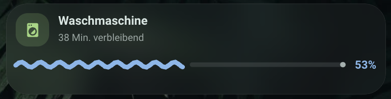
type: custom:m3-progress-card
entity: sensor.washing_machine_status
percentage_entity: sensor.washing_machine_progress_percent
remaining_entity: sensor.washing_machine_remaining_minutes
name: Washing Machine
icon: mdi:washing-machine
glass_background: true
Status logic
The status sensor is matched (case-insensitively) to one of four categories, each with its own status text:
| Category | Default status values | Default status text | Bar |
|---|---|---|---|
| Running | wash, spin, rinse |
"{remaining} min. remaining" | animated wave |
| Preparing | detecting_load |
"Detecting load…" | animated wave (even without a percentage value: an "indeterminate" segment sweeps across the track) |
| Done | end, finished |
"Done! Laundry is clean." | bar at 100%, wave settles into a straight line |
| Ready (all other values) | – | "Ready" | hidden, card collapses to header height |
The status-value lists are freely configurable via running_states /
preparing_states / done_states; {remaining} in the status text is
replaced with the value of remaining_entity (if the sensor is missing,
only the minutes part is dropped, no crash). percentage_entity/
remaining_entity are optional — without percentage_entity, the bar runs
as an indeterminate animation in the "preparing" state.
Configuration options
| Option | Type | Default | Description |
|---|---|---|---|
entity |
string | Required | Status sensor |
percentage_entity |
string | – | Sensor with progress in percent (0–100) |
remaining_entity |
string | – | Sensor with remaining time in minutes |
name |
string | entity friendly_name |
Displayed name |
icon |
string | mdi:washing-machine |
Icon in the icon tile |
status_text_running / _preparing / _done / _ready |
string | see table above | Status text per category; {remaining} as a placeholder in status_text_running |
running_states / preparing_states / done_states |
string[] | see table above | Status values per category (case-insensitive) |
animation |
auto | on | off |
auto |
auto/on respect the system's prefers-reduced-motion (then a static line); off always disables the animation |
wave_style |
wavy | flat |
wavy |
Only with animation: off — frozen wave or straight line; both still show fill level/gap/dot |
hide_when_ready |
boolean | false |
Hide the whole card in the "ready" state (instead of just the bar) |
glass_background |
boolean | true |
Frosted glass background (off for solid themes) |
radius |
number (px) | 28 |
Card corner radius |
corners |
object | – | Optional per-corner override: top_left, top_right, bottom_right, bottom_left (px) |
Colors
All colors are optional; unset fields follow the theme. Internally stored
as CSS custom properties (--m3p-accent, --m3p-track, --m3p-dot, …) on
the card — so they can also be overridden via card-mod or a theme if
needed.
| Option | Default | Description |
|---|---|---|
accent_color |
#85b7eb |
Wave, percentage, icon |
track_color |
12% --primary-text-color |
Flat track |
dot_color |
70% --primary-text-color |
End-point dot |
icon_color |
accent color | Icon color |
icon_background |
18% icon color | Icon tile background |
text_color |
--primary-text-color |
Name |
secondary_text_color |
--primary-text-color |
Status line |
card_background |
glass/solid background | Card background |
state_colors.running / .preparing / .done |
– | Overrides accent_color only for that category (e.g. green when "done") |
type: custom:m3-progress-card
entity: sensor.washing_machine_status
percentage_entity: sensor.washing_machine_progress_percent
remaining_entity: sensor.washing_machine_remaining_minutes
state_colors:
  done: green
M3 Energy Card
A bar chart for energy values (solar generation, consumption, ...). mode
provides two fundamentally different views:
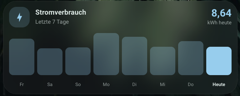
mode: consumption(default) — bars per day or per hour for a single entity, seeperiodbelow.mode: solar— the day's solar generation timeline including a forecast, see its own section further below.
mode: consumption isn't limited to electricity — unit and icon are taken
from the entity (icon automatically based on device_class: gas →
flame, water → water drop, otherwise lightning bolt, unless explicitly
set via icon), so the mode works just as well for gas or water meters.
mode: consumption — time ranges via period
period: day(default) — the last N days as bars plus today's value prominently in the header, live from the current entity state.period: hour— the last N hours of today plus the running hour, with a value row above the bars.period: month— the last N months (rolling, including the current month) with a projection, average line, and comparison chips, see its own section further below.
type: custom:m3-energy-card
entity: sensor.solar_energy_total_daily
name: Solar Generation
icon: mdi:solar-power
accent_color: "#66bb6a"
period: day
days: 7
type: custom:m3-energy-card
entity: sensor.grid_consumption_hourly
name: Consumption per Hour
icon: mdi:lightning-bolt
period: hour
hours: 6
Data retrieval
Past days/hours/months are loaded primarily via HA's long-term statistics
(recorder/statistics_during_period, configurable via statistic_type):
state(default forperiod: day/hour) — the last raw value of the period, suitable for meter sensors that periodically reset (e.g.*_daily/*_hourlysensors like Shelly's). Equivalent to what amini-graph-cardwould show withaggregate_func: max.change— the difference within the period, suitable for a never-reset cumulative counter. Default forperiod: month: even a daily- resetting counter needschangehere, because itsstateat month granularity only returns the value of the last day of the month (a few kWh), not the monthly sum —changecorrectly accumulates across all daily resets instead.
If the entity has no long-term statistics, a History API fallback kicks in
automatically for period: day/hour (values aggregated by maximum per
day/hour). For period: month there is no fallback (a month-scale History
query would be impractically large) — instead the card shows a clear
message. Whether an entity has long-term statistics can be checked under
Developer tools → Statistics — the editor also shows a hint for
period: day/hour if it doesn't. The current day/hour/month is always
computed live (or, for change, via a short-term statistics sum since the
period start), not from long-term statistics, since that period isn't
complete yet. Data refreshes every 15 minutes in day mode, every 5 minutes
in hour mode, and hourly in month mode.
Interaction
Tapping a bar briefly shows a value bubble with the amount (with a slight
morph: corner radius 9→6px, brightening); tapping the header opens the
entity's more-info view. On first render, bars grow in with a stagger
(30ms per bar) to their target height — respects the animation option
and prefers-reduced-motion. In hour mode, with more than 12 bars (e.g.
hours: 24) the value row is automatically hidden and only every other
hour label is shown, so it doesn't get too cramped.
period: month — projection, comparison, average
type: custom:m3-energy-card
entity: sensor.grid_consumption_daily
name: Consumption per Month
icon: mdi:calendar-month
period: month
months: 12
- Projection: the current month is shown as a filled actual bar plus a
dashed outline — the outline shows where the month would land at the
current daily average (
actual value ÷ days elapsed × days in month). Can be disabled viashow_projection: false. - Average line: a dashed horizontal line at the level of the average
of completed months. Can be disabled via
show_average: false. - Comparison chips below the header (can be disabled via
show_comparison: false):- Chip 1 compares the projection (or the actual value, if
show_projection: false) to the previous month in percent — green for less consumed, red for more. For generation values (e.g.mode: solaror your own meters), flip this logic withhigher_is_better: trueso "more" is green. - Chip 2 shows the average of the completed months ("avg X kWh").
- Chip 1 compares the projection (or the actual value, if
- With
months > 12, only every other month is labeled, so the axis doesn't get too cramped (same threshold as in hour mode).
mode: solar — day timeline with forecast
Shows today's solar generation timeline as bars plus, if available, a forecast overlay (dashed outline):
type: custom:m3-energy-card
mode: solar
source: energy
name: Solar Generation
glass_background: true
source: energy(default) — automatically sums all solar sources from the HA Energy dashboard (Settings → Dashboards → Energy), without needing to specify an entity manually.source: entity— uses a single, freely chosenentityinstead.- Forecast: loaded automatically via
energy/solar_forecastif a forecast integration (Forecast.Solar, Solcast, …) is configured in the Energy dashboard. Alternatively,forecast_entityprovides your own forecast entity (expects awh_hoursattribute, timestamp → Wh — the format used by Forecast.Solar/Solcast sensors). If no forecast is available, the card works normally, just without the outline bars and without "of X kWh expected" in the header. - Bars: past/running hours filled (running hour full accent color, past hours as a 30% tint); future hours only as a dashed outline (pure forecast); if the running hour is still below the forecast, the difference is stacked as a dashed outline on top of the filled bar.
- Time range: automatically trimmed to the first through last hour
with generation or forecast > 0 (not 0–24h, otherwise there would be
empty bars in the morning/at night);
full_day: trueforces the full 0–24h range. - Statistic type: solar sensors from the Energy dashboard are almost
always lifetime counters (never reset), so the default here is
changeinstead ofstate(see Data retrieval above). - Comparison/average chips (like
period: month, see above): one chip shows today's (generation + forecast) value in % over/under yesterday, a second shows the average of the last 7 days. Controlled viashow_comparison/show_average(both on by default).
Configuration options
| Option | Type | Default | Description |
|---|---|---|---|
mode |
consumption | solar |
consumption |
Bars per day/hour or a solar day timeline with forecast |
entity |
string | Required except for mode: solar + source: energy |
Energy sensor |
statistic_type |
state | change |
state (change for mode: solar or period: month) |
Statistic type for the bar values |
period |
day | hour | month |
day |
Bars per day, hour, or month — only for mode: consumption |
days |
number | 7 |
Number of past days (3–14), only for period: day |
hours |
number | 6 |
Number of past hours (3–24), only for period: hour |
months |
number | 12 |
Number of months including the current one (3–24), only for period: month |
source |
entity | energy |
entity |
Only for mode: solar: single entity or all Energy-dashboard solar sources |
forecast_entity |
string | — | Only for mode: solar: your own forecast entity (optional, fallback when no Energy-dashboard forecast is configured) |
full_day |
boolean | false |
Only for mode: solar: always show 0–24h instead of trimming |
show_values |
boolean | false |
Show the value row above the bars in day mode too (it's on by default in hour mode; not available for mode: solar/period: month) |
show_legend |
boolean | true |
Only for mode: solar: "Generated"/"Forecast" legend below the bars (only visible if a forecast is present) |
show_projection |
boolean | true |
Only for period: month: show the current month's projection as a dashed outline |
show_average |
boolean | true |
Only for period: month: show the dashed average line |
show_comparison |
boolean | true |
Only for period: month: show comparison chips (previous month, average) below the header |
higher_is_better |
boolean | false |
Only for period: month: flip the comparison chip's color logic (for generation instead of consumption values) |
comparison_better_color |
string | #81c784 |
Only for period: month: comparison chip color for "better" |
comparison_worse_color |
string | #e57368 |
Only for period: month: comparison chip color for "worse" |
name |
string | entity friendly_name |
Displayed name |
icon |
string | mdi:solar-power (mdi:solar-power-variant for mode: solar) |
Icon in the icon tile |
subtitle |
string | "Last {days} days" / "Today · last {hours} hours" / "Per month · {months} months" / "Today · day timeline" | Subtitle override |
accent_color |
string | #81c784 |
Accent color (current bar, current value, icon, outline forecast/projection) |
bar_tint_color |
string | 28% accent color (30% for mode: solar) |
Color of past bars |
text_color / secondary_text_color |
string | theme default | Name / axis labels |
card_background |
string | glass/solid background | Card background |
animation |
auto | on | off |
auto |
Affects the tap-morph + grow-in effect; auto/on respect prefers-reduced-motion |
glass_background |
boolean | true |
Frosted glass background |
radius / corners |
number / object | 28 |
Corner radius, optional per corner |
M3 Gauge Card
Replaces an energy-grid-neutrality-gauge tile: shows the ratio of two
quantities (e.g. grid import vs. export) as a semicircular arc with the net
value in the middle. Two segments with a small gap at the transition point
— the gap itself is the "pointer", not a separate needle.
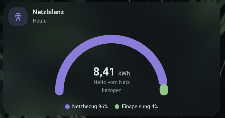
type: custom:m3-gauge-card
name: Grid Balance
Data sources
source: energy(default, no further configuration needed if the HA Energy dashboard is set up): reads the configured grid import/export statistic IDs fromenergy/get_prefs(multiple meters/tariffs are summed automatically) and loads their daily values.source: entities: two freely chosen sensors (value_a_entity= import,value_b_entity= export), the time reference then lies with the sensors themselves. Not limited to electricity — the unit is taken from the configured entities, e.g. for comparing two gas or water meters.
If both values are 0, the arc shows only the track color ("No data today" or "No Energy dashboard configured"); if only one value is 0, the whole arc fills continuously in one color without a gap.
Animation
The segments grow from 0 to their target angle on first render and ease
smoothly on later value changes — respects the animation option and
prefers-reduced-motion like the other cards.
Configuration options
| Option | Type | Default | Description |
|---|---|---|---|
source |
energy | entities |
energy |
Data source |
value_a_entity / value_b_entity |
string | – | Only for source: entities — import / export sensor |
name |
string | Grid Balance |
Displayed name |
icon |
string | mdi:transmission-tower |
Icon in the icon tile |
subtitle |
string | "Today" | Subtitle override |
label_positive / label_negative |
string | "Net drawn from grid" / "Net fed into grid" | Text below the net value, depending on sign |
label_a / label_b |
string | "Grid import" / "Export" | Legend labels |
segment_a_color / segment_b_color |
string | #8f79e0 / #81c784 |
Segment colors |
track_color |
string | 12% --primary-text-color |
Arc color with no data |
text_color / secondary_text_color |
string | theme default | Net value / name & legend |
card_background |
string | glass/solid background | Card background |
animation |
auto | on | off |
auto |
Segment animation; auto/on respect prefers-reduced-motion |
glass_background |
boolean | true |
Frosted glass background |
radius / corners |
number / object | 28 |
Corner radius, optional per corner |
M3 Energy Flow Card
A node diagram of today's energy flows between solar, grid, battery, and home, with animated flow dots along the connection lines and a self-sufficiency bar below.
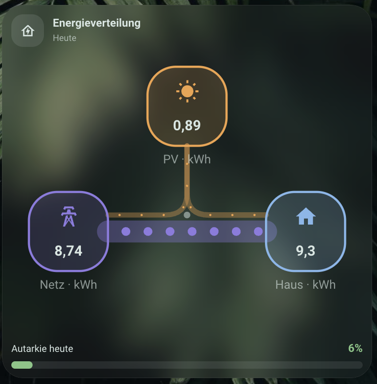
type: custom:m3-energy-flow-card
source: energy
Data sources
source: energy(default): reads solar, grid import/export, and battery statistics directly from the HA Energy dashboard.source: entities:solar_entity,grid_import_entity,grid_export_entity,battery_entityare freely chosen — useful when no full Energy dashboard is set up or individual sources need to be replaced.
The battery node automatically appears only if a battery source is
configured (show_battery: auto, default) — always/never force its
visibility regardless.
Animation
The flow dots run via a CSS animation along the lines
(flow_speed: slow | normal | fast) and are omitted entirely (not just
paused) when animation: "off" or prefers-reduced-motion is active.
Configuration options
| Option | Type | Default | Description |
|---|---|---|---|
source |
energy | entities |
energy |
Data source |
solar_entity / grid_import_entity / grid_export_entity / battery_entity |
string | – | Only for source: entities |
name |
string | "Energy Flow" | Displayed name |
icon |
string | mdi:transmission-tower |
Icon in the icon tile |
show_self_sufficiency |
boolean | true |
Show the self-sufficiency bar |
show_battery |
auto | always | never |
auto |
Battery node visibility |
flow_speed |
slow | normal | fast |
normal |
Flow dot speed |
pv_color / grid_color / home_color / battery_color |
string | theme default | Node colors |
self_sufficiency_color |
string | #81c784 |
Self-sufficiency bar color |
text_color / secondary_text_color |
string | theme default | Name / node labels |
card_background |
string | glass/solid background | Card background |
animation |
auto | on | off |
auto |
Flow-dot animation; auto/on respect prefers-reduced-motion |
glass_background |
boolean | true |
Frosted glass background |
radius / corners |
number / object | 28 |
Corner radius, optional per corner |
M3 Counter Card
Replaces a tile card for meter readings: shows a cumulative sensor value
as an odometer-style digit display, each digit in its own cell. Integer and
decimal digits are colored separately (decimals in the accent color). Only
the digits that actually changed on the last update roll animated — the
rest stay put. Not limited to electricity: unit and decimal places come
from the entity, power_entity (power chip) is entirely optional — just as
suitable for gas or water meters (m³) as for electricity meters (kWh).
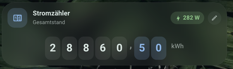
type: custom:m3-counter-card
entity: sensor.virtual_electricity_meter
power_entity: sensor.total_power_consumption
name: Electricity Meter
Digit display
- The number of integer digits (
digits) grows automatically with the value (default: at least 5) and never shrinks back within a session, even if the value briefly drops — prevents the card width from "jumping". Alternatively, a fixed number can be configured; it too grows as needed to never truncate the value. - The decimal separator and number format follow
hass.locale(e.g. comma instead of period in German). - If the card is narrower than 340px, the digit cells shrink automatically (ResizeObserver).
unavailable: cells show a dimmed "–", the power chip is hidden.
Power chip and ticker
power_entity(optional) shows a chip with a lightning-bolt icon and the current power in the header — default color green, switchable viapower_thresholds(e.g. orange above 2000 W, red above 3500 W).show_ticker+daily_entity(both optional) show a thin "+X today" line below the digit display, fed from a separate daily sensor.
Configuration options
| Option | Type | Default | Description |
|---|---|---|---|
entity |
string | – | Meter-reading sensor (required) |
power_entity |
string | – | Optional power sensor for the header chip |
daily_entity |
string | – | Optional daily sensor for the ticker line |
name |
string | entity name | Displayed name |
icon |
string | mdi:counter |
Icon in the icon tile |
subtitle |
string | "Total reading" | Subtitle override |
decimals |
number | 2 |
Number of decimal places |
digits |
auto | number |
auto |
Integer digits — automatic (min. 5, never shrinks back) or fixed |
show_ticker |
boolean | false |
Show the "+X today" line (needs daily_entity) |
accent_color |
string | #85b7eb |
Color of the decimal-digit cells |
cell_background |
string | 8% --primary-text-color |
Background of the integer-digit cells |
power_chip_color |
string | #81c784 |
Default power-chip color |
power_thresholds |
{ above, color }[] |
– | Chip color change above the given power |
text_color / secondary_text_color |
string | theme default | Name / subtitle & ticker |
card_background |
string | glass/solid background | Card background |
animation |
auto | on | off |
auto |
Roll animation; auto/on respect prefers-reduced-motion |
glass_background |
boolean | true |
Frosted glass background |
radius / corners |
number / object | 28 |
Corner radius, optional per corner |
M3 Power List Card
Replaces an entities card for smart-plug/power overviews: shows power
sensors as a sorted list with share bars, hiding inactive devices behind a
collapsible section by default.
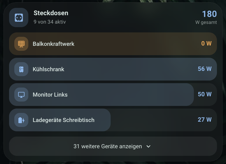
type: custom:m3-power-list-card
auto_discover: true
name: Smart Plugs
Entity source
- Manual list (
entities): an array withentity(required) and optionallyname,icon,type(consumer|producer, defaultconsumer) per entry. The editor manages the list as a simple sensor picker; per-entry name/icon/type overrides can be fine-tuned directly in the card's YAML editor. auto_discover: true: automatically picks up everysensorentity withdevice_class: power, optionally restricted toinclude_area/include_label, plusexclude_entitiesto exclude specific ones.
Sorting, threshold, producers
threshold(default1W) determines when a device counts as "active" — prevents sensor noise (e.g. 0.2 W) from showing up as active.sortsorts the active consumer rows:power_desc(default),power_asc,name, orconfig(order as configured).- Entries with
type: producer(e.g. a balcony solar unit) appear in their own, visually distinct section above the consumer list and don't count toward the consumers' sorting or total. max_visible(default0= all active) limits the visible consumer rows; the rest move into the collapsible section for inactive devices.- The list smoothly reorders when crossing the threshold (respects the
animationoption andprefers-reduced-motion).
Configuration options
| Option | Type | Default | Description |
|---|---|---|---|
entities |
list | – | Manual sensor list (ignored if auto_discover: true) |
auto_discover |
boolean | false |
Automatically pick up all sensors with device_class: power |
include_area / include_label |
string[] | – | Only for auto_discover — restrict to areas/labels |
exclude_entities |
string[] | – | Only for auto_discover — exclude specific entities |
threshold |
number | 1 |
Threshold in W above which a device counts as "active" |
sort |
power_desc | power_asc | name | config |
power_desc |
Sorting of active consumers |
max_visible |
number | 0 |
Max. visible active rows (0 = all) |
show_idle_toggle |
boolean | true |
Show the collapsible section for inactive/overflow devices |
name |
string | "Smart Plugs" | Displayed name |
icon |
string | mdi:power-socket-de |
Icon in the icon tile |
subtitle |
string | "{active} of {total} active" | Subtitle override |
accent_color |
string | #85b7eb |
Color of consumer icons/values |
producer_color |
string | #f0a24a |
Producer-section color |
bar_tint_color |
string | accent color | Share-bar color |
text_color / secondary_text_color |
string | theme default | Name / subtitle & total |
card_background |
string | glass/solid background | Card background |
animation |
auto | on | off |
auto |
Reorder animation; auto/on respect prefers-reduced-motion |
glass_background |
boolean | true |
Frosted glass background |
radius / corners |
number / object | 28 |
Corner radius, optional per corner |
M3 Power Summary Card
Replaces a set of individual tile cards for instantaneous power: combines
grid balance, consumption, generation, and optional sub-totals into one
card with a clear hierarchy. Pure live values from hass.states, no
statistics queries needed.
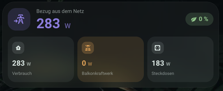
type: custom:m3-power-summary-card
grid_entity: sensor.grid_power
consumption_entity: sensor.total_power_consumption_pre_solar
solar_entity: sensor.balcony_solar_power
metrics:
  - entity: sensor.total_power_consumption_pre_solar
    name: Consumption
    icon: mdi:home-lightning-bolt
  - entity: sensor.balcony_solar_power
    name: Balcony Solar
    icon: mdi:solar-power-variant
    type: producer
  - entity: sensor.total_power_consumption
    name: Smart Plugs
    icon: mdi:power-socket-de
Sign convention
Instantaneous power sensors at the grid connection encode export/import
differently. grid_sign sets the card to the respective convention:
negative_is_export(default): negative value = export, positive value = import — the most common convention (e.g. Shelly 3EM, many inverter integrations).positive_is_export: the reverse.
The displayed value is always a positive amount — icon and label show the
direction. If the amount is within zero_threshold (default 10 W) of 0,
the card shows a neutral "Balanced" state instead of export/import.
Share bar and self-sufficiency
- If
solar_entityis set and generation is > 0, a two-part bar shows how current consumption is covered: self-consumption from solar vs. surplus (when exporting) or vs. grid share (when importing). Can be disabled viashow_split_bar. - The self-sufficiency chip (
show_self_sufficiency, on by default) is computed as(consumption − grid import) / consumption × 100, clamped to 0–100%. - If
consumption_entityisn't set, consumption is computed asgrid import + solar generation.
Configuration options
| Option | Type | Default | Description |
|---|---|---|---|
grid_entity |
string | – | Instantaneous power at the grid connection, in W (required) |
grid_sign |
negative_is_export | positive_is_export |
negative_is_export |
Sign convention of the grid sensor |
consumption_entity |
string | – | Home consumption in W (empty = computed from grid import + solar) |
solar_entity |
string / string[] | – | Generation sensor(s) in W, summed |
metrics |
list | – | Additional metric fields (entity, name, icon, color, type) |
label_export / label_import |
string | "Export to grid" / "Import from grid" | Main row label per direction |
show_self_sufficiency |
boolean | true |
Show the self-sufficiency chip |
show_split_bar |
boolean | true |
Show the share bar (only with solar_entity configured) |
zero_threshold |
number | 10 |
Threshold in W for the neutral "balanced" state |
kw_threshold |
number | 1000 |
Above this value in W, formatted as "X.X kW" instead of "X W" |
export_color / import_color |
string | #81c784 / #8f79e0 |
Colors for export / import |
producer_color |
string | #f0a24a |
Color for producer metrics and the solar share |
accent_color |
string | #81c784 |
Self-sufficiency chip color |
text_color / secondary_text_color |
string | theme default | Values / labels |
card_background |
string | glass/solid background | Card background |
animation |
auto | on | off |
auto |
Smooth value interpolation (300ms); auto/on respect prefers-reduced-motion |
glass_background |
boolean | true |
Frosted glass background |
radius / corners |
number / object | 28 |
Corner radius, optional per corner |
M3 Top Consumers Card
Replaces the native energy-devices-graph card: shows the biggest
individual consumers for a time range as a ranking, by default fed from
the devices section of the HA Energy dashboard.
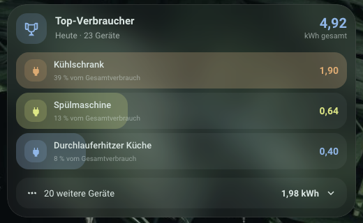
type: custom:m3-top-consumers-card
source: energy
period: today
top_count: 7
Data source and time range
source: energy(default): reads the configured device statistic IDs fromenergy/get_prefsand loads their consumption for the chosenperiod(today,yesterday,week,month) viarecorder/statistics_during_period. The header total is the sum of the MEASURED devices, not necessarily the entire home consumption.source: entities: a manual list of energy sensors (kWh) viaentities, for when no Energy dashboard is set up or a custom selection is desired.- Refreshes every 15 minutes. Devices with 0 kWh in the period are omitted entirely.
Ranking, overflow row, name cleanup
- Sorted descending by consumption.
top_count(default 7) devices are shown as full rows with share bars. - All remaining devices land, depending on
rest_mode, in a collapsible overflow row (collapse, default), are omitted entirely (hide), or are also shown as full rows (show_all). name_stripremoves regex/text patterns from entity names (default:^Plug \d+ -andEnergy$); overridable per device vianameinentities(an override disables cleanup for that device).- Device colors are assigned cyclically from
palette(default: 8 tones from the project's color system), fixed per device viacolor. - Reordering on data refresh is smoothly animated (respects
animation/prefers-reduced-motion).
unit_mode: cost — rank by cost instead of kWh
type: custom:m3-top-consumers-card
source: energy
unit_mode: cost
price_source: energy_dashboard
Ranks devices by cost instead of consumption (value per device = kWh ×
price). The price source (price_source) works identically to the M3 Cost
Card further below — see there for details on
energy_dashboard/input_number/fixed. Since HA doesn't keep a separate
cost statistic per device (only for total grid import), with
price_source: energy_dashboard an effective price is derived from total
cost ÷ total grid-import consumption for the chosen period. The row
subtitle becomes two-part ("{kWh} kWh · {x}% of cost"), header total and
overflow row appear in currency.
Configuration options
| Option | Type | Default | Description |
|---|---|---|---|
source |
energy | entities |
energy |
Data source |
entities |
list | – | Only for source: entities — entity, optionally name/icon/color |
period |
today | yesterday | week | month |
today |
Time range |
top_count |
number | 7 |
Number of full rows before the overflow row |
rest_mode |
collapse | hide | show_all |
collapse |
Behavior for devices beyond top_count |
name_strip |
string[] | see above | Regex/text patterns removed from entity names |
unit_mode |
energy | cost |
energy |
Rank by kWh or by cost |
price_source / price_entity / price / price_unit / currency |
see M3 Cost Card | energy_dashboard |
Only for unit_mode: cost |
name |
string | "Top Consumers" | Displayed name |
icon |
string | mdi:trophy-outline |
Icon in the icon tile |
subtitle |
string | "{period} · {n} devices" | Subtitle override |
accent_color |
string | #85b7eb |
Color of the header total |
palette |
string[] | see above | Cyclically assigned device colors |
text_color / secondary_text_color |
string | theme default | Name / subtitle & percentage row |
card_background |
string | glass/solid background | Card background |
animation |
auto | on | off |
auto |
Reorder animation; auto/on respect prefers-reduced-motion |
glass_background |
boolean | true |
Frosted glass background |
radius / corners |
number / object | 28 |
Corner radius, optional per corner |
M3 Cost Card
A cost breakdown for a time range (default: current month) with
projection, comparison to the previous period, daily bars, and time-range
navigation to browse past months. Not limited to electricity — entity
can be any cumulative energy sensor (with price_source: energy_dashboard
the grid-import cost statistic is used automatically).
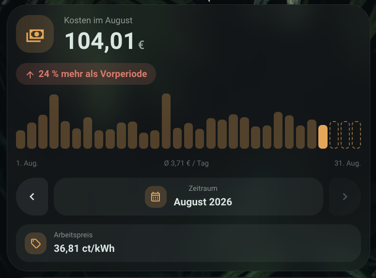
type: custom:m3-cost-card
price_source: energy_dashboard
period: month
Price source (price_source)
energy_dashboard(default): reads the cost statistic HA already computes for grid import (stat_costfromenergy/get_prefs) — the card doesn't compute anything itself here. Requirement: a price is set for grid import in the Energy dashboard (fixed price orentity_energy_price), AND the recorder has processed at least one statistics run since the price was set —stat_costcan therefore still benullfor a while even with a price already configured. Without an available cost statistic, the card shows a hint with a link to/config/energyinstead of a made-up number.input_number:price_entitypoints to aninput_numberhelper (unit price in €/kWh or ct/kWh, detected viaprice_unitor the helper's unit). Cost = consumption (entity, kWh) × price. The tariff row shows the current price; tapping it opens the helper in the more-info dialog to adjust (no dedicated stepper — the price rarely changes in practice, so a permanently visible slider isn't worth it).fixed: a fixedpricein the card config, no tariff interaction.
base_fee (€/month) is added to the cost total pro-rated per day already
elapsed, for period: month.
Time-range navigation
Below the daily bars (or directly below the chips for period: day) sits
a navigation row with ‹/› arrows that flips to the previous/next period —
handy for comparing completed months. For already-completed periods, the
projection is automatically dropped (the period is fully over); the
comparison chip then compares the actual total to the period before it.
The "next" arrow is disabled once the current (running) period is reached.
Projection, comparison, budget
- Projection chip (
show_projection, on by default): projected to the end of the period (amount ÷ days elapsed × total days). Too unreliable on the first day of the period — shows "Projection from tomorrow" instead. Only for the current period, not when browsing past months. - Comparison chip (
show_comparison, on by default): projection (or, when browsing: the actual total) vs. the previous period in percent, green for less, red for more. - Budget chip (optional
budget): "X% of budget", color changes above 100%. - If feed-in compensation exceeds the cost (a negative total), the card shows the amount in green with the label "Credit".
Configuration options
| Option | Type | Default | Description |
|---|---|---|---|
price_source |
energy_dashboard | input_number | fixed |
energy_dashboard |
Price source, see above |
price_entity |
string | – | Only for input_number — the price helper |
price |
number | – | Only for fixed — price per kWh |
price_unit |
eur_per_kwh | ct_per_kwh |
detected from the helper / eur_per_kwh |
Unit of the price |
base_fee |
number | – | Base fee €/month, pro-rated for period: month |
currency |
string | EUR |
ISO currency code for formatting |
entity |
string | – | Energy sensor (kWh); not needed with price_source: energy_dashboard |
period |
day | month | year |
month |
Time range |
show_projection |
boolean | true |
Show the projection chip |
show_comparison |
boolean | true |
Show the comparison chip |
budget |
number | – | Optional budget for the budget chip |
name |
string | "Cost" | Displayed name |
icon |
string | mdi:cash-multiple |
Icon in the icon tile |
subtitle |
string | "Cost in {month}" (period-dependent) | Subtitle override |
accent_color |
string | #f0a24a |
Accent color |
text_color / secondary_text_color |
string | theme default | Amount / label & footer |
card_background |
string | glass/solid background | Card background |
animation |
auto | on | off |
auto |
Bar/value animation; auto/on respect prefers-reduced-motion |
glass_background |
boolean | true |
Frosted glass background |
radius / corners |
number / object | 28 |
Corner radius, optional per corner |
M3 Light Card
Light control with a header (icon, name, power button) and a wave slider
for brightness — drag with mouse or finger, tap to jump, arrow keys for
±5% (Shift for ±1%). The slider uses touch-action: none, so swiping on a
phone doesn't conflict with page scrolling.
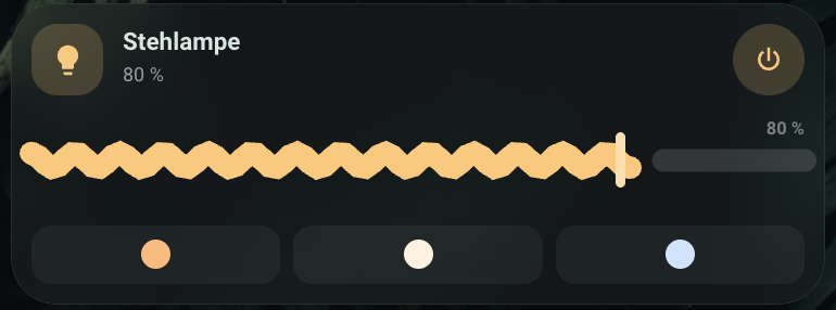
type: custom:m3-light-card
entity: light.living_room
Brightness changes are throttled (~200ms) and sent as light.turn_on with
brightness_pct, and applied optimistically in the UI so dragging stays
smooth even on a slow network connection. Entities without brightness
support (e.g. simple on/off lamps) show only the header and power button,
no slider.
Configuration options
| Option | Type | Default | Description |
|---|---|---|---|
entity |
string | – | light entity (required) |
name |
string | entity name | Displayed name |
icon |
string | entity icon | Icon in the icon tile |
transition |
number | – | Transition duration (seconds) for light.turn_on calls |
wave_style |
wavy | flat |
wavy |
Slider wave shape |
accent_color / track_color / handle_color |
string | theme default | Slider colors |
text_color / secondary_text_color |
string | theme default | Name / subtitle |
card_background |
string | glass/solid background | Card background |
animation |
auto | on | off |
auto |
Wave/power-button animation; auto/on respect prefers-reduced-motion |
glass_background |
boolean | true |
Frosted glass background |
radius / corners |
number / object | 28 |
Corner radius, optional per corner |
M3 Battery Card
An overview of all battery-level sensors as a sorted list with threshold- based coloring (critical/low/medium/ok), a bar per row, and a collapsible section for the remaining devices.
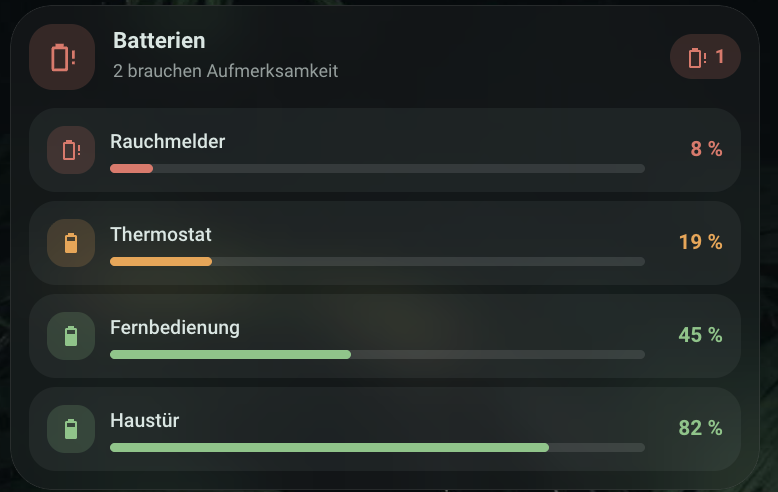
type: custom:m3-battery-card
auto_discover: true
Entity source
auto_discover: true(default): automatically finds every entity withdevice_class: battery, optionally filtered viainclude_area/include_label/exclude_entities. Entries inentitiesact as a name/icon override per entity in this mode (not a full replacement of the automatic list).auto_discover: false: only the selection explicitly listed inentities.
name_strip removes configurable suffixes from the displayed name
(default: " Battery Level", " Batteriestand", " Battery", " Batterie") —
so the entity name "Bedroom Battery Level" becomes "Bedroom".
Sorting, thresholds, display
Rows are always unavailable first, then sorted ascending by charge level
— so the devices most likely to need attention appear at the top.
thresholds (critical/low/medium) determine bar and text color;
max_visible + show_healthy_toggle hide healthy devices behind a "show
N more" button, similar to the Power List Card.
Low-battery notification
The card only warns while you're looking at it, so the editor's
Benachrichtigung section can create a Home Assistant automation that
notifies you regardless. Pick one or more notify targets (built from your
own notify.* services), a threshold (notify_threshold, default 1 %) and
a rhythm, then press "Benachrichtigung einrichten":
daily/weekly— one digest atnotify_timelisting every weak battery ("5 Batterien schwach: …"), so a dozen low devices don't become a dozen pushes.weeklyadditionally fires only onnotify_weekday.on_change— fires the moment a battery crosses below the threshold, one message per device. Re-arms by itself once the battery is back above.
The automation watches exactly the devices the card lists — the manual
entities list, or auto-discovery including any area/label filters. That
set is resolved when you press the button and written into the automation,
so press it again after adding new devices to cover them too.
notify_exclude_entities mutes individual devices without removing them
from the card — useful for sensors permanently reporting 1 %.
Configuration options
| Option | Type | Default | Description |
|---|---|---|---|
auto_discover |
boolean | true |
Automatic discovery of all battery sensors |
entities |
list | – | Manual selection, or overrides when auto_discover: true |
include_area / include_label |
list<string> | – | Filter for auto-discovery |
exclude_entities |
list<string> | – | Entities excluded from auto-discovery |
name_strip |
list<string> | see above | Name suffixes to remove |
thresholds |
object (critical/low/medium) |
10/20/50 |
Percentage thresholds for coloring |
max_visible |
number | – | Number of directly visible rows, rest behind "show more" |
show_healthy_toggle |
boolean | true |
Collapsible section for devices above the medium threshold |
notify_service |
list<string> | – | Notify targets for the low-battery reminder (without the notify. prefix) |
notify_threshold |
number | 1 |
Percentage at or below which a battery counts as weak |
notify_mode |
daily | weekly | on_change |
daily |
Digest at a fixed time, weekly, or immediately on crossing |
notify_time |
string | 18:00:00 |
Time of the digest (daily/weekly only) |
notify_weekday |
string | mon |
Weekday of the digest (weekly only) |
notify_exclude_entities |
list<string> | – | Devices that never trigger a notification |
name / icon |
string | "Batteries" / mdi:battery |
Header |
critical_color / low_color / medium_color / ok_color / unavailable_color |
string | theme default | Threshold colors |
text_color / secondary_text_color |
string | theme default | Name / values |
card_background |
string | glass/solid background | Card background |
animation |
auto | on | off |
auto |
Expand/collapse animation; auto/on respect prefers-reduced-motion |
glass_background |
boolean | true |
Frosted glass background |
radius / corners |
number / object | 28 |
Corner radius, optional per corner |
M3 Weather Card
A weather card with a header (icon/temperature/condition/chips), a smoothed temperature curve with gradient fill, hourly precipitation bars, sunrise/ sunset markers on the curve, and an optional daily overview.
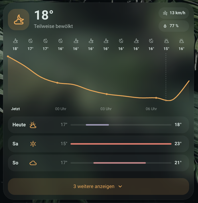
type: custom:m3-weather-card
entity: weather.forecast_home
Setting up weather data
The card needs some weather.* entity — it doesn't generate its own
weather data. If you don't have a weather integration set up yet (the
editor shows a matching hint in that case), Home Assistant's built-in
Met.no integration works for most locations: free, no API key needed,
automatically uses your Home zone's coordinates.
Settings → Devices & Services → Add Integration → search for "Met.no" →
confirm the location. A new weather.* entity is then available to pick.
Other weather integrations (OpenWeatherMap, AccuWeather, Pirate Weather, ...) work the same way, but usually require a free API key from the provider.
The hourly forecast is always loaded; the daily overview only if days is
set above 0. Both are fetched via the weather.get_forecasts service and
refreshed every 15 minutes. If the weather entity briefly goes
unavailable (e.g. a DNS/network hiccup in the integration), the card
keeps showing the last known reading with a "Last known reading · X min
ago" hint instead of going blank — "Unavailable" only appears if no data
was ever received. How many days are actually available depends on the
weather integration (Met.no delivers 6 days max); from 4 days on, the
daily list collapses by default and expands via a button.
Configuration options
| Option | Type | Default | Description |
|---|---|---|---|
entity |
string | – (required) | weather entity |
name |
string | entity's friendly name | Header title |
hours |
number | 12 |
Number of hours in the curve |
days |
number | 0 |
Number of days in the daily overview (0 = hidden) |
show_days_toggle |
boolean | true |
Collapsible from 4 days on with a "Show N more" button; false = always show all configured days directly |
chips |
list (apparent_temperature|wind_speed|humidity|pressure|uv_index|visibility) |
apparent temp, wind, humidity | Header chips shown |
show_sun |
boolean | true |
Sunrise/sunset markers on the curve (from sun.sun) |
accent_color |
string | solar yellow | Curve color |
precipitation_color |
string | #6ba7dc |
Precipitation bar color |
gradient_color |
string | same as accent_color |
Gradient fill under the curve |
text_color / secondary_text_color |
string | theme default | Temperature/title vs. chips/secondary values |
card_background |
string | glass/solid background | Card background |
animation |
auto | on | off |
auto |
Curve draw-in animation; auto/on respect prefers-reduced-motion |
glass_background |
boolean | true |
Frosted glass background |
radius / corners |
number / object | 28 |
Corner radius, optional per corner |
M3 Presence Card
A presence overview as an avatar grid for person and device_tracker
entities, with a status ring (home/away/zone/unknown), an initials avatar,
a relative time label ("since 5 min"), and an optional embedded map
(hui-map-card).
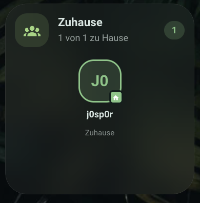
type: custom:m3-presence-card
auto_discover: true
Entity source
auto_discover: true(default): automatically finds everypersonentity, optionally filtered viainclude_area/include_label/exclude_entities.auto_discover: false: only the selection explicitly listed inentities(person.*ordevice_tracker.*).
Tapping opens the entity's more-info dialog; a long press (500ms)
optionally triggers hold_action (e.g. navigating to a dashboard view).
Configuration options
| Option | Type | Default | Description |
|---|---|---|---|
auto_discover |
boolean | true |
Automatic discovery of all person entities |
entities |
list<string> | – | Manual selection when auto_discover: false |
include_area / include_label |
list<string> | – | Filter for auto-discovery |
exclude_entities |
list<string> | – | Entities excluded from auto-discovery |
name / icon |
string | "Presence" / mdi:account-group |
Header |
show_distance |
boolean | false |
Distance to the home zone (if available) |
show_since |
boolean | true |
Relative time since the last state change |
show_map |
boolean | false |
Embedded map below the avatar grid |
sort |
home_first | name |
home_first |
Sort order: home first or alphabetical |
home_color / not_home_color / zone_color / unknown_color |
string | green/blue/purple/gray | Status ring colors |
zone_colors |
object (zone name → color) | – | Override per named zone |
hold_action |
action object | – | Action on a long press (500ms) on an avatar |
text_color / secondary_text_color |
string | theme default | Names vs. status line |
card_background |
string | glass/solid background | Card background |
animation |
auto | on | off |
auto |
Status-change animation; auto/on respect prefers-reduced-motion |
glass_background |
boolean | true |
Frosted glass background |
radius / corners |
number / object | 28 |
Corner radius, optional per corner |
M3 Media Card
A media player card with a compact view (off/idle) and a full playback view: artwork with color extraction for the accent, a locally interpolated progress wave slider, transport controls (shown/hidden per feature), a volume wave slider, source selection, and a browser for the player's media library and queue.
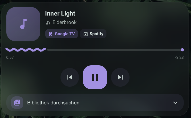
type: custom:m3-media-card
entity: media_player.living_room
The playback position is interpolated client-side from media_position +
media_position_updated_at, so progress keeps advancing smoothly between the
player's own state updates. The wave flattens to a straight line when playback
is paused, so the bar carries the play state; a stream with no duration shows a
travelling wave segment and a Live chip instead of a remaining time.
Transport buttons, shuffle/repeat, seeking and the library all appear only when
the entity reports the matching supported_features. This matters more than it
sounds: a Chromecast playing a single local file reports neither
PREVIOUS_TRACK nor NEXT_TRACK, so those buttons are legitimately absent —
the card will not offer an action the player would reject. The same player over
Spotify does report them, and they appear.
Players that report no metadata at all (a Chromecast on the Default Media
Receiver, for instance) fall back to the file path behind media_content_id:
…/<Artist>/<Album>/<Track>.mp3 becomes artist, album and title. Real metadata
always wins over this.
Library and queue
Where the player supports BROWSE_MEDIA, a row at the bottom of the card opens
Home Assistant's own media browser: breadcrumb navigation, a thumbnail or a
media_class icon per row, folders to drill into and playable entries that
start on tap. Where the integration also exposes a queue, a second tab lists
what is coming up and the collapsed row reads "Up next: …" instead of "Browse
library"; integrations without one (Cast and Spotify among them) simply do not
get that tab rather than showing an empty one.
A level with thousands of entries is capped at 100 rows with a note pointing further in — one real library here returns 2147 artist folders in a single level, and rendering them all locks the frame.
Configuration options
| Option | Type | Default | Description |
|---|---|---|---|
entity |
string | – (required) | media_player entity |
name |
string | entity's friendly name | Title in the compact view |
show_source_select |
boolean | false |
Source-select pills (if supported by the entity) |
show_shuffle_repeat |
boolean | false |
Shuffle/repeat buttons (if supported); repeat cycles off → all → one |
strip_track_number |
boolean | true |
Drop a leading track number from the title (07 - Enjoy the Silence → Enjoy the Silence). Bounded to one or two digits, so 1979 and 365 Dreams survive |
time_display |
remaining | total |
remaining |
Right-hand time: remaining with a minus sign, or the total length |
meta_chips |
list | [] |
Extra chips beside device and source: track, year, bitrate. Each is rendered only when the player actually reports the attribute — note that HA has no standard bitrate attribute, so most integrations never fill that one |
show_browser |
boolean | true |
The library/queue section (only ever shown for players reporting BROWSE_MEDIA) |
default_tab |
queue | library |
library |
Which tab opens first, where both exist |
browse_height |
number | 190 |
Max height of the browse list in px |
use_artwork_color |
boolean | true |
Extract the accent color from the artwork instead of accent_color |
accent_color |
string | purple (media palette) | Progress/volume color when use_artwork_color: false |
text_color / secondary_text_color |
string | theme default | Title vs. artist/album |
card_background |
string | glass/solid background | Card background |
animation |
auto | on | off |
auto |
Progress/volume animation; auto/on respect prefers-reduced-motion |
glass_background |
boolean | true |
Frosted glass background |
radius / corners |
number / object | 28 |
Corner radius, optional per corner |
M3 Climate Overview Card
A compact overview of every temperature/humidity sensor, grouped by room: one tile per room (temperature + humidity merged), a horizontal comparison scale with a dot per room, and a header chip pointing out whichever room deviates furthest from the comfortable range.
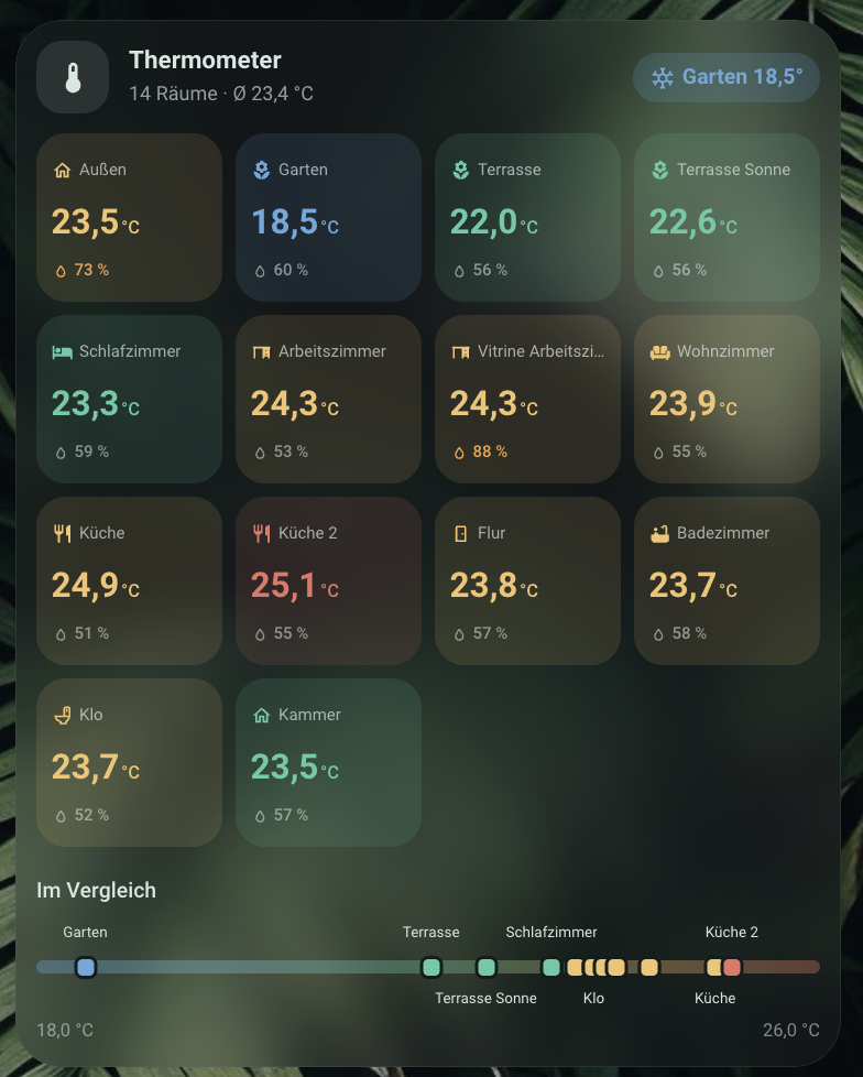
type: custom:m3-climate-overview-card
auto_discover: true
Entity source and room grouping
auto_discover: true(default): finds everysensorentity withdevice_class: temperatureorhumidity. Sensors assigned to a Home Assistant area are grouped into that area's tile (using the area's own name/icon); sensors without an area but sharing a device (e.g. a combo temp+humidity sensor) are grouped by device instead; anything left over becomes its own tile, named from its (cleaned-up) entity name. Rooms without a temperature sensor are skipped — humidity alone doesn't make a room. Filter withinclude_area/exclude_entities.rooms: a manual list (name,icon,temperature_entity,humidity_entity) instead of auto-discovery — set this to build the overview by hand.
name_strip cleans up names picked up from a device/entity rather than an
area (default strips "Temperature"/"Temperatur" suffixes and
"Thermometer N - "/"Thermostat " prefixes) — e.g. "Thermometer 6 -
Arbeitszimmer" becomes "Arbeitszimmer". Since most real setups have areas
only partially configured, this frequently produces more tiles than
distinct rooms (one per un-grouped device) — narrow it down with
exclude_entities or switch to a manual rooms list for a clean result.
Color stages, comparison scale, outlier chip
Each tile's temperature is colored by temp_thresholds (four boundaries →
five stages: cold/cool/comfortable/warm/hot); humidity turns the warning
color outside humidity_range. The comparison scale (show_scale) plots
every room's temperature as a dot along the same color gradient, with
room-name labels alternating above/below (dots-only with a tooltip above 8
rooms); it hides itself with fewer than 2 rooms. The outlier chip
(show_outlier_chip) highlights whichever single room sits furthest
outside the comfortable band — coldest on the cold side, warmest on the
hot side — and disappears once every room is comfortable.
show_trend adds a small arrow when a room's temperature changed by more
than 0.5 K in the last hour (fetched via the History API, refreshed every
15 minutes). show_mold_warning adds a warning icon on tiles above 65%
humidity and below 18°C.
Configuration options
| Option | Type | Default | Description |
|---|---|---|---|
auto_discover |
boolean | true |
Automatic discovery of temperature/humidity sensors |
include_area |
list<string> | – | Filter for auto-discovery |
exclude_entities |
list<string> | – | Entities excluded from auto-discovery |
rooms |
list (name, icon, temperature_entity, humidity_entity) |
– | Manual room list instead of auto-discovery |
name_strip |
list<string> | see above | Name suffixes/prefixes to remove from auto-discovered names |
name / icon |
string | "Climate" / mdi:thermometer |
Header |
sort |
area | temp_desc | temp_asc | name |
area |
Tile order |
show_scale |
boolean | true |
Comparison scale below the tile grid |
show_outlier_chip |
boolean | true |
Header chip for the most conspicuous room |
show_trend |
boolean | false |
Arrow for a >0.5 K change in the last hour |
show_mold_warning |
boolean | false |
Warning icon above 65% humidity and below 18°C |
temp_thresholds |
object (cold/cool/comfortable/warm) |
19/20.5/23.5/25 |
Boundaries between the five color stages |
humidity_range |
[number, number] |
[35, 65] |
Comfort band; outside it uses the warning color |
scale_min / scale_max |
number | automatic from the readings | Fixed comparison-scale range |
cold_color / cool_color / comfortable_color / warm_color / hot_color |
string | blue/teal/green/amber/red | Temperature stage colors |
humidity_warn_color |
string | amber | Humidity color outside humidity_range |
accent_color |
string | theme default | Header icon accent |
text_color / secondary_text_color |
string | theme default | Room names/values vs. secondary text |
card_background |
string | glass/solid background | Card background |
animation |
auto | on | off |
auto |
Comparison-scale dot animation; auto/on respect prefers-reduced-motion |
| `glass_backgro |
Comments