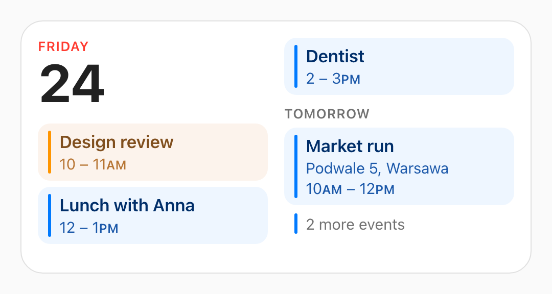
Widget cards for Home Assistant dashboards, styled like the ones on a phone's home screen: sensible defaults instead of a config to fill in, and a shape taken from the box you drag them into rather than from a size setting.
Live demo · Install · The calendar · The batteries · Card rules · Ring rules
The demo runs every size live, with sample data and the clock under your control, and hands you the config to paste when you like what you see: nothing to install to look.
Status: early. Two cards. The calendar draws your real calendars and to-do lists and lays itself out exactly like the phone's. The battery card draws any battery sensors you point it at.
It needs a current Home Assistant, 2026.7 or newer: the cards track the latest frontend APIs rather than carrying compatibility shims.
The calendar
Today's date, then today's events, then as much of the days after today as the card has
room for, one continuous flow poured through however many columns the footprint gives it.
Each event is tinted with the colour of the calendar it came from, and anything due out of
your to-do lists joins the same flow at its own time. Empty days are not listed as empty,
they simply do not appear, and whatever is left of the day the card ran out of room in
becomes 2 more events.
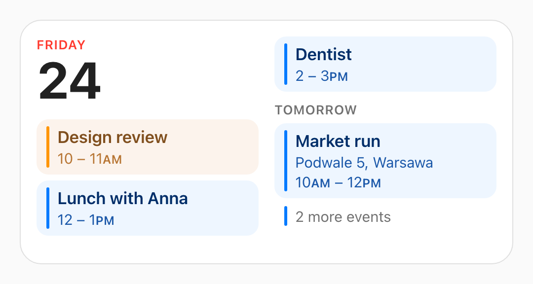
Medium. A full day, then tomorrow. Dentist is still today;
the flow simply ran out of left column.
|
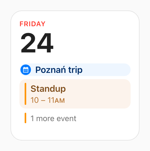
Small. Today and nothing else, ever. The badge is an all-day event, which has no time to show and so gets a row to itself. |
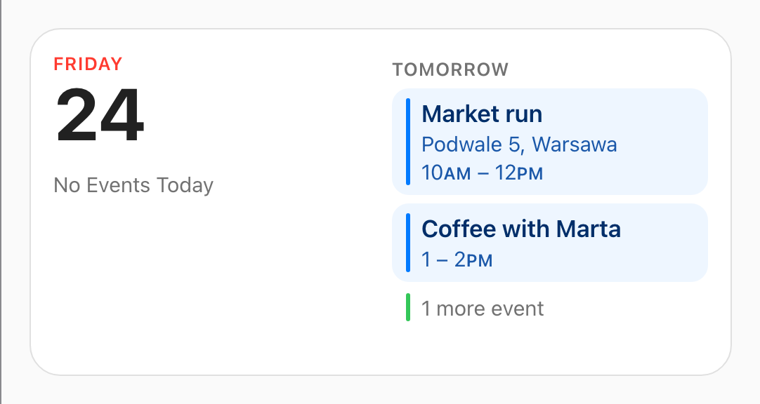
A quiet day. Nothing today, so it says so, and rather than leave the other column empty as well, the flow starts there with tomorrow. |
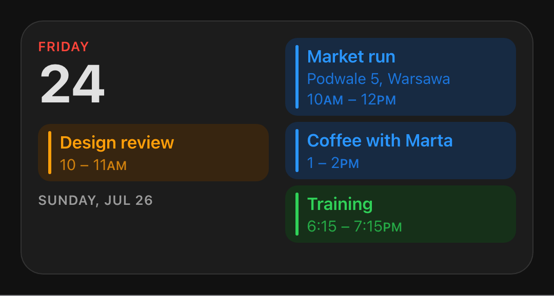
Dark theme. It follows the one you picked in Home Assistant. Tomorrow is empty here, so it is skipped, and the heading becomes a date, because TOMORROW has to mean literally tomorrow.
|
Those are fixtures rather than anybody's real week. What the card decides to show, and in
what order, is written down in
docs/calendar-widget-rules.md, down to why 5 – 6PM
prints only one PM.
The batteries
A ring per device, green all the way, with the level read off the length of the arc and a bolt on whatever is charging. Point it at the battery sensors you actually care about and it works out the rest: how many rings across, whether there is room for the percentages, and how big to draw them. Four devices per card at these two sizes: two across in the square, four across in the wide one.
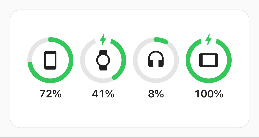
Medium. Four devices fit one row, so they keep their percentages. The bolts are the two on a charger. |
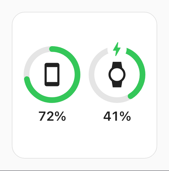
Small. One or two devices in the square is the left half of the medium card, percentages and all. |
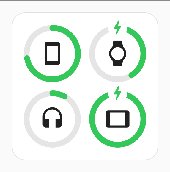
Three or more in the square. The percentages come off and the grid closes up; a caption is worth a row of its own, and past one row there is nowhere to keep buying it. |
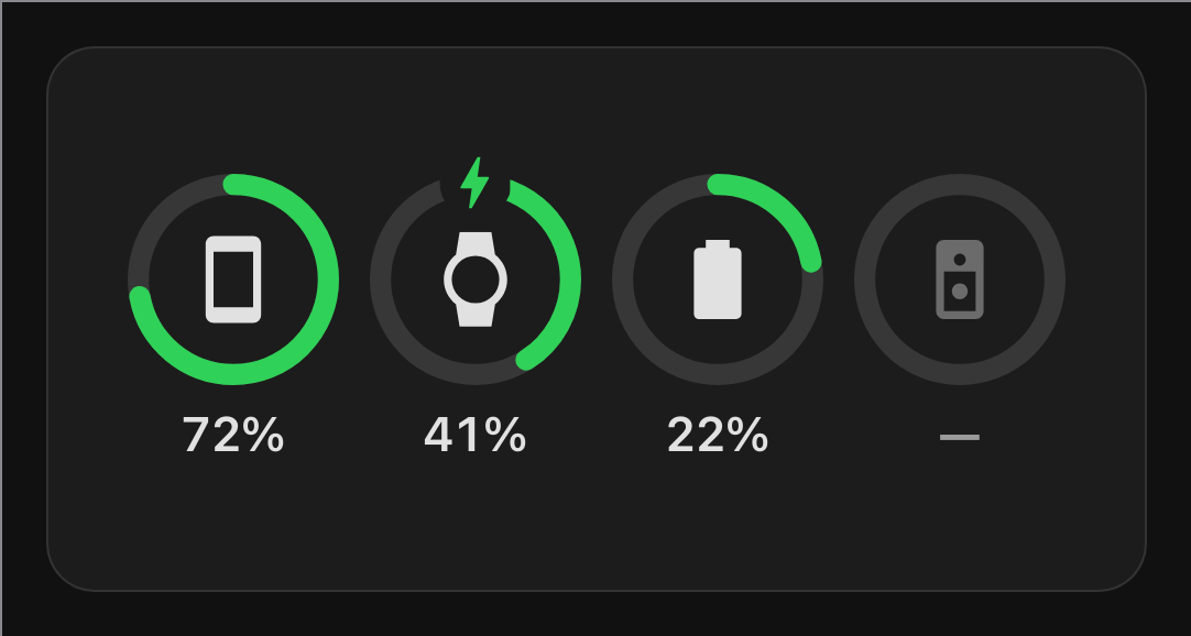
Dark theme. It follows the one you picked in Home Assistant. The last ring is empty with its icon dimmed and a dash for a reading, since that device has stopped reporting, which is a thing the card says rather than hides. |
The ring is green at 5% as much as at 95%, and that is on purpose: the arc's length is already
the reading, so a colour changing underneath it would be a second, coarser version of the same
number. docs/battery-widget-rules.md has the whole argument,
along with every rule above.
Install
Through HACS, which is where a dashboard card belongs; it registers the resource for you and tells you when there is a new version.
- Open HACS in the Home Assistant sidebar.
- ⋮ in the top right → Custom repositories.
- Paste
https://github.com/sabbaken/cupertino-widgetsinto Repository, pick Dashboard as the Type, and press Add. - Search HACS for Cupertino Widgets, open it, and press Download.
- Reload the browser once, so the dashboard picks the new resource up.
Then add a card. The next section shows how.
Adding a card
Both cards are in the dashboard's card picker (Cupertino Calendar and Cupertino Batteries), and both have a visual editor, so there is no YAML to write unless you want to.
The calendar
Five fields: Calendars, which calendars feed it; Reminders, whether your to-do items are drawn beside the events; To-do lists, which lists those come from; Clock, which format it prints times in; and Scale, how large to draw it. Leave all of them alone and you get every calendar, every to-do list, your Home Assistant time format, and 100%.
The equivalent YAML, if you prefer it:
type: custom:cupertino-widgets-calendar
entities: # optional; leave it out for every calendar
  - calendar.work
  - calendar.personal
show_reminders: true # optional; false leaves your to-do lists out entirely
todo_entities: # optional; leave it out for every to-do list
  - todo.chores
time_format: system # optional; system | 12 | 24
scale: 100 # optional; 80–130, percent
| Option | Default | Meaning |
|---|---|---|
entities |
every calendar | Which calendar.* entities to draw. Omit it rather than empty. |
show_reminders |
true |
Whether reminders are drawn. false reads no to-do list at all. |
todo_entities |
every to-do list | Which todo.* entities to read. Omit it rather than empty. |
time_format |
system |
system follows your profile; 12 or 24 overrides it. |
scale |
100 |
Percent. Draws the whole widget larger or smaller. 80–130. |
12, 24 and scale are read whether or not you quote them.
On reminders. A reminder is a to-do item with a due date: the date is what gives it a day to be drawn on, so an item without one never appears, and neither does one you have ticked off. An item due at a time reads like an event, with the time under its title; one due on a date reads as a single line, with no invented midnight under it. Both are drawn in the same stream as the events rather than in a section of their own, which is where a to-do due at half past ten belongs: between the nine o'clock meeting and the noon one.
On system. It follows the time format in your Home Assistant profile, and that
setting's own auto-detection reads the browser's locale, which is the only channel a
browser offers. A Mac set to AM/PM behind a browser set to British English detects 24-hour
and there is no web API that would know better. That is what 12 and 24 are for.
Colours come from the colour set on each calendar in Home Assistant's entity settings, and otherwise from this library's own palette, dealt in the same order Home Assistant's own calendar panel deals its own, so a calendar keeps the colour you have got used to. A to-do list has no colour to take in Home Assistant, so its circle comes from that palette by the position of the list. Every calendar and every list is subscribed to rather than polled, so the card follows Home Assistant as events and items change.
The batteries
A list of devices, then Scale. This is the one card that draws nothing useful before it is
configured: it says No Devices, because an installation's battery sensors are every remote,
every valve and every door contact, and no order over them would be the one you meant.
Press Add a device (which opens the list of sensors straight away), pick one, and it joins the list as a panel of its own. Open the panel and everything about that device is in one place: which battery sensor, its icon, its charging sensor and its name. Drag a panel by the handle to move its ring; the bin in its header removes it. Each field shows what the card will draw if you leave it empty, and the picker does not offer a sensor that is already in the list, so nothing here needs YAML.
type: custom:cupertino-widgets-battery
entities:
  - sensor.phone_battery
  - sensor.watch_battery
  # a row can carry more than an id, for the things a sensor cannot say itself:
  - entity: sensor.tablet_battery
    charging_entity: binary_sensor.tablet_charging
    name: Tablet
    icon: mdi:tablet
scale: 100 # optional; 80–130, percent
| Option | Default | Meaning |
|---|---|---|
entities |
none | Which devices, in the order the rings follow. Ids or rows. |
charging_entity |
the sensor's own | A binary_sensor that is on while the device charges. |
name |
friendly_name |
Tooltip and screen-reader label only; never drawn. |
icon |
the sensor's own | Any mdi: name. This is the only thing that says which device. |
scale |
100 |
Percent. Draws the whole widget larger or smaller. 80–130. |
Four rings, and a longer list is not an error. Both sizes here draw four devices and stay
quiet about the rest, so a card given six shows the first four and looks pixel-for-pixel like
a card given four. Writing six now is groundwork for a large size with two rows to put them
in; until then four is the design rather than a shortfall, and the wide card in particular does
not stack a stub row under a full one.
Worth setting icon. Home Assistant computes a battery sensor's icon from its level, so
without one you get a battery glyph inside a battery ring, six times over. It sits under the
battery sensor in a device's panel, and it is the one thing on this card that says which
device a ring is. The only sensor the picker cannot offer you is a battery percentage published
without the battery device class; that one still works, it just has to be named in YAML.
Charging is detected without help where the sensor says so itself: is_charging or
battery_state on its attributes, which is what many integrations publish. charging_entity
is for the rest, and it is the separate binary sensor the companion app and friends ship.
A device whose sensor cannot be read is still drawn: an empty ring, a dimmed icon and a dash instead of a percentage. That is the point of putting the card up.
How big it is
There is no size option. Resize a card the normal way (the Layout tab in the dashboard
editor) and it works out which of the two widget shapes fits the box you gave it. The calendar
shows today in the square and today plus what follows it in the wider 2:1; the battery card
puts two rings across the square and four across the 2:1. The line is at 340px of card, roughly
9 of the 12 columns in a section of the usual width, and it moves with scale, because larger
type needs more room before two columns of it stop truncating every title.
| footprint | comes out at | shape |
|---|---|---|
| 6 × 4 rows | ~246 × 248 px | the small square |
| 12 × 4 rows | ~500 × 248 px | the medium 2:1 |
Everything between and around them works too; that is the whole point of measuring the box instead of reading a preset. A card dragged taller fills the extra height rather than leaving it blank: the calendar with more rows of the week, the battery card with bigger rings, since its rows are its devices and there is nothing else to put there. One dragged narrow folds to a single column, or to two rings across. But those two footprints are the proportions the content was laid out for. A new card arrives full width and 4 rows tall, and can be dragged down to 4 columns by 3 rows; a square that short holds the date and the next event and nothing else, so it is one to leave at 100% or below.
scale is the other question. The footprint settles how much room the card has; scale
settles how large what goes in it is drawn: the type at 80% or 130% of the size above, along
with the spacing around it, for a wall tablet read from across the room or a dense dashboard
read at a desk. One factor over the whole widget, so the card at 120% is the card at 100% seen
from closer up rather than a differently proportioned one.
It is spent out of whatever the card has to give, which is the trade worth knowing about. On the calendar that is rows: the same footprint that holds 4 under the date and 7 in the second column at 100% holds 2 and 5 at 130%, and 6 and 9 at 80%, so a card scaled up wants dragging taller and a card scaled down fills the height it has with more of the day. On the battery card the rows are the devices and cannot be given up, so the rings shrink instead: the same four devices in the same box, drawn smaller. Values outside 80–130 are clamped rather than refused.
The Layout tab writes its footprint into grid_options, which is Home Assistant's own and
belongs to every card rather than to this one.
The widgets
| Widget | Status |
|---|---|
| Calendar | events, live |
| Battery levels | live |
| Reminders, in the calendar card | to-do items with a due date |
| A to-do list of its own | planned |
Development
pnpm dev serves the showcase with no Home Assistant needed, pnpm test runs the layout
rules as unit tests. docs/development.md has the rest: the two
loops, how the screenshots are generated, and where everything lives.
Comments